[OC] Bitcoin Historical Returns Matrix (2014–2026): Visualizing 12 Years of Seasonality, Halvings, and New ATHs by Ok-Astronaut4817
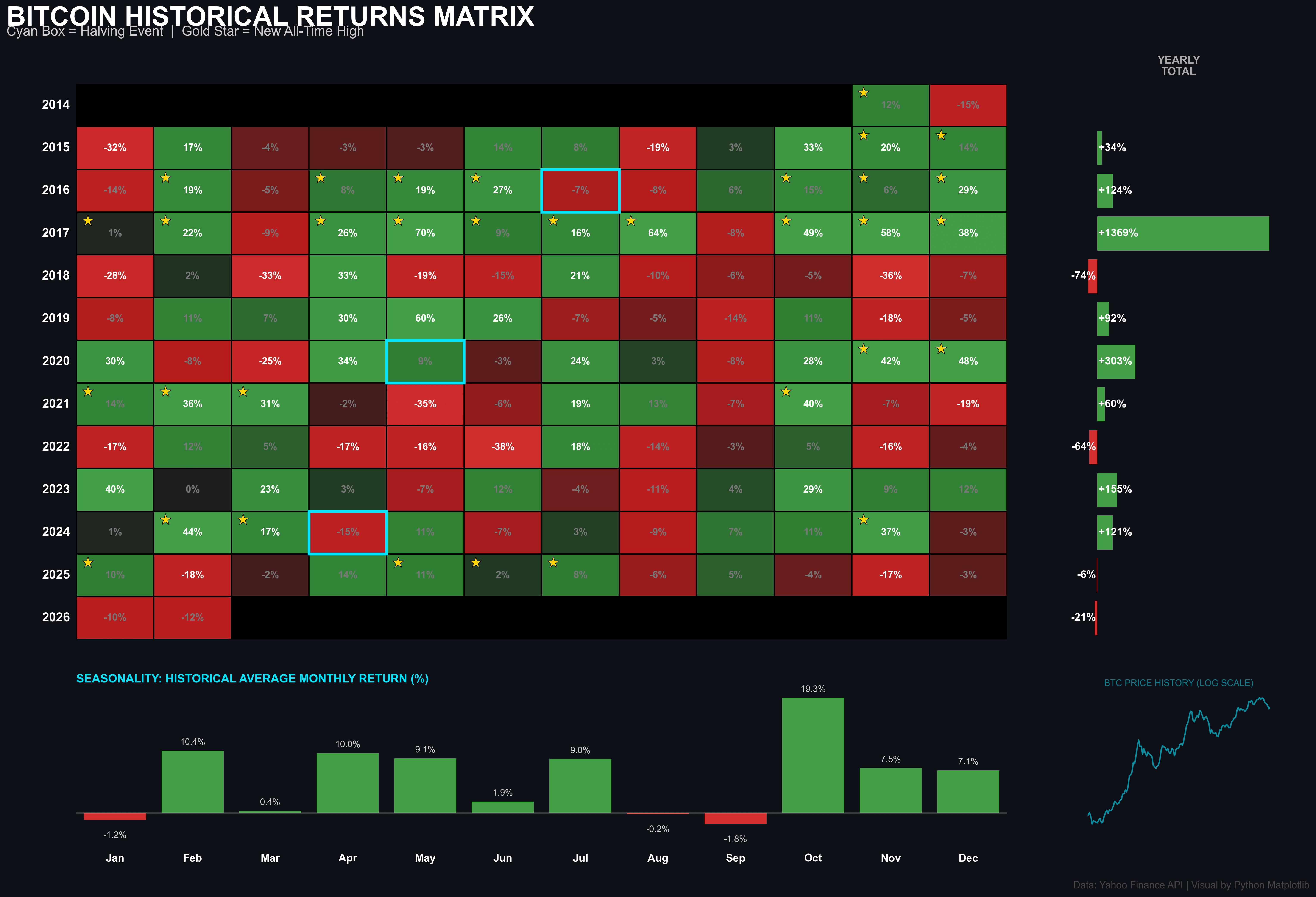
Ok-Astronaut4817 on February 20, 2026 5:18 pm I built this visualization using Python (Matplotlib) to track how BTC performs month-over-month. Key features: Cyan Box: Halving Events (the supply shock points). Gold Star: Months where a new All-Time High (ATH) was reached. Seasonality Chart: Shows that October remains the strongest month historically (avg +19.3%), while January and September tend to be “red” months. Data Source: Yahoo Finance API (up to Feb 13, 2026). Tools: Python, Pandas, Matplotlib.

1 Comment
I built this visualization using Python (Matplotlib) to track how BTC performs month-over-month.
Key features:
Cyan Box: Halving Events (the supply shock points).
Gold Star: Months where a new All-Time High (ATH) was reached.
Seasonality Chart: Shows that October remains the strongest month historically (avg +19.3%), while January and September tend to be “red” months.
Data Source: Yahoo Finance API (up to Feb 13, 2026).
Tools: Python, Pandas, Matplotlib.