
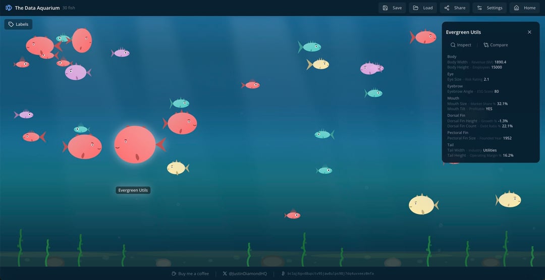
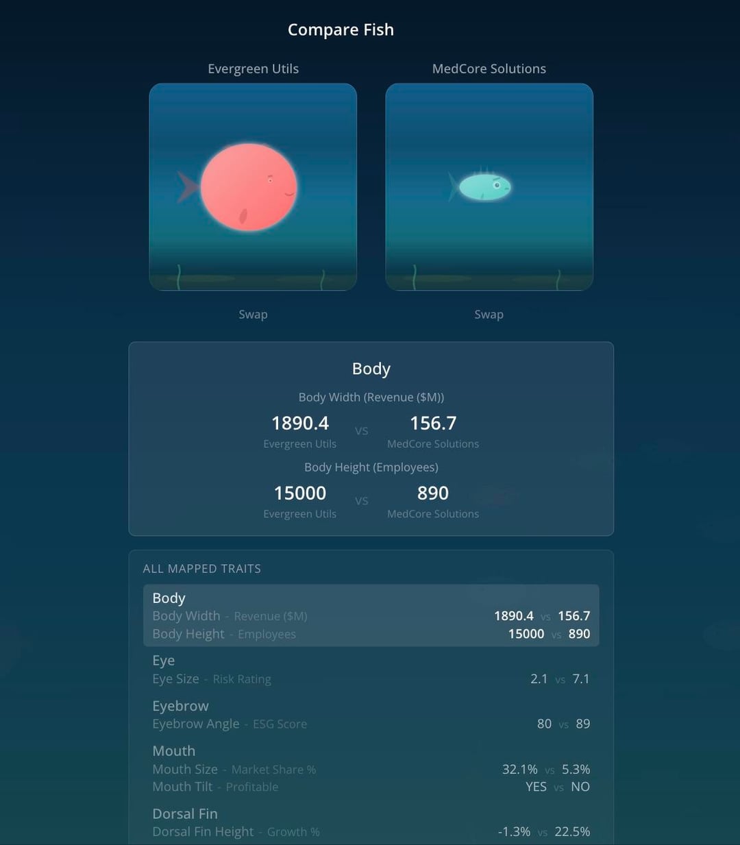
Hello all! I just launched dataaquarium.com, the first website that lets you visualize multidimensional data as cartoon fish. For extra context, you can see my demo video here: https://x.com/justindiamondhq/status/2022132150829805937?s=46&t=vLDoQzH2rLbHRyAimAjAyg
by JustinDiamondHQ
1 Comment
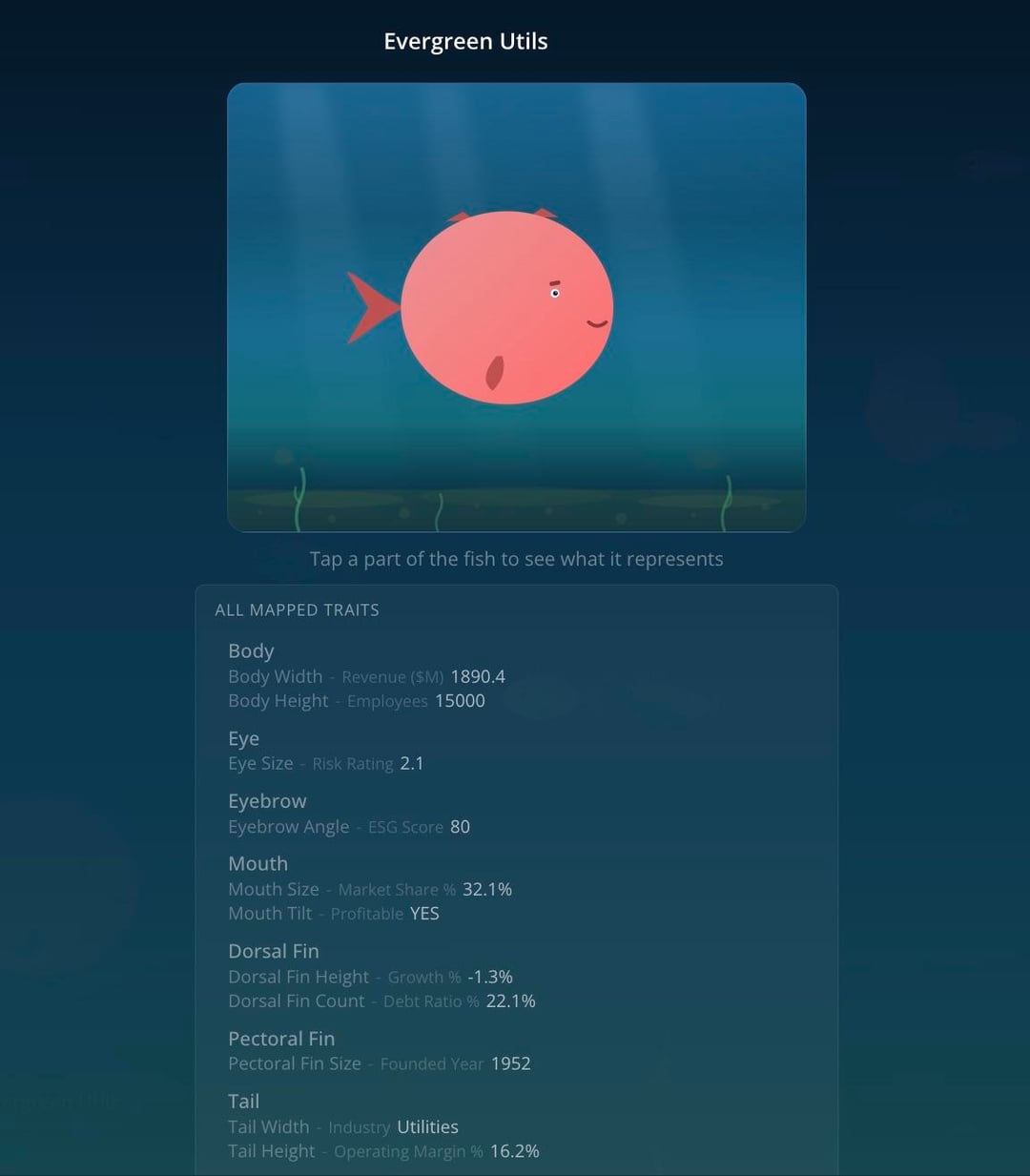
This is actually a fun way to make multidimensional data less intimidating. Mapping size, color, and maybe speed to different variables feels way more intuitive than staring at another scatterplot.
Curious how you’re thinking about scale though. If someone uploads a dataset with heavy skew, like a few massive outliers, do the “big fish” just dominate the whole tank? Normalization choices probably change the story a lot.
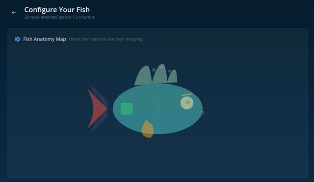
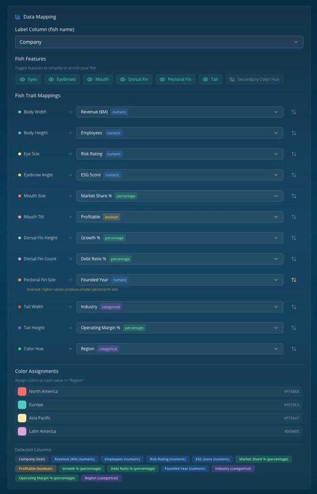
Also would be cool if users could toggle which variable maps to which fish trait and see the aquarium re balance in real time. That kind of interactivity makes the relationships click way faster than static charts.