
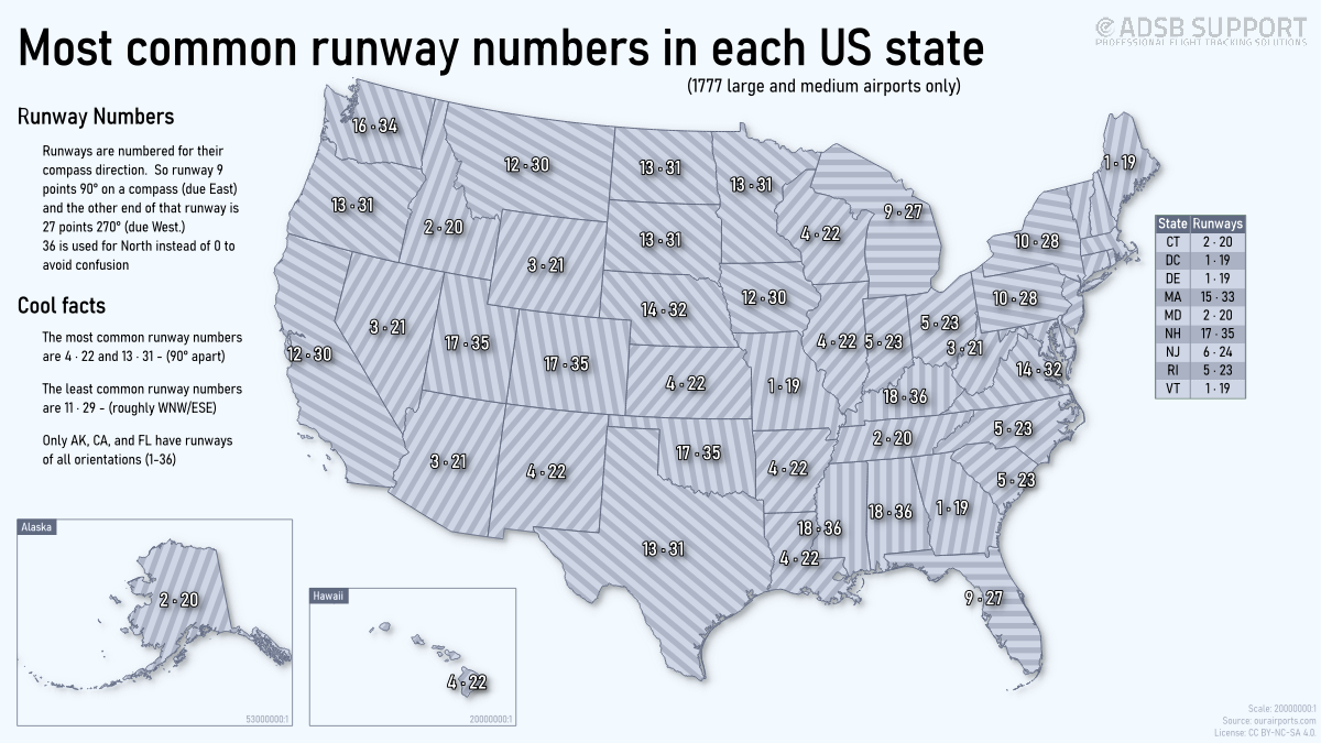
This is a visualization I did that looks at all the major airport runways in the United States, and shows the most common orientation in each state. This was a self-training improvement exercise for me, so I encourage you to give me any constructive criticism on how it could be improved.
I'm considering to do Europe, and other continents/countries as well if there is any interest.
I used runway data from ourairports.com, manipulated it in LibreOffice Calc, and mapped it in QGIS 3.44
by ADSBSGM
3 Comments
Runway data is from ourairports.com, then manipulated it in LibreOffice Calc, and mapped in QGIS 3.44
Does this tell us something about prevailjng winds?
I see what you are going for here, but the numbers are unreadable with that background. Too many busy similarly gray elements. You might need to up the color contrast and enlarge/bold the labels so they can stand out from the background pattern.