
Hi everyone!
I'm building a small website that visualizes race results for endurance winter sports – XC Skiing, Biathlon, and Skimo. Pre-race predictions, post-race analytics, various chart types.
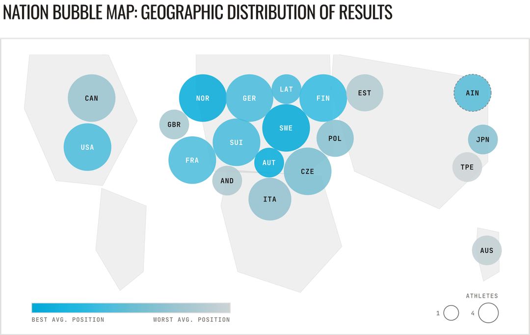
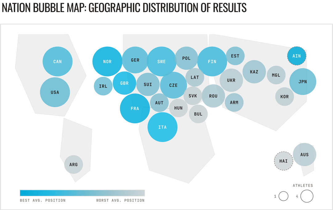
Here are two examples from the 2026 Olympics in Tesero – Geographic Bubble Maps for the Men's 20km and Women's 15km Skiathlon.
Each bubble represents a participating country. Bubble size reflects athlete count, while color intensity indicates average finishing position: vivid for top performers, washed out for lower ranks.
Tools: React, Recharts, custom SVG with force-directed simulation (TypeScript) for the bubble map layout
Data source: FIS-SKI official results
Visualization: endurance-analytics.com
Disclosure: I'm a backend developer. To build this visualization, I teamed up with my wife for design and used AI agents to handle the frontend implementation.
by Few_Classroom_5697
1 Comment
**Tools:** React, Recharts, custom SVG with force-directed simulation (TypeScript) for the bubble map layout
**Data source:** [FIS-SKI official results](https://www.fis-ski.com/DB/general/results.html?sectorcode=CC&raceid=49723)
**Visualization:** [endurance-analytics.com](https://endurance-analytics.com/en/skiing/2025-26/olympics/ski2526og-milano2026/ski2526og_sm_sk_20#analytics)
I’m new to Reddit, and as far as I understand, I need to repost this information in the comments