
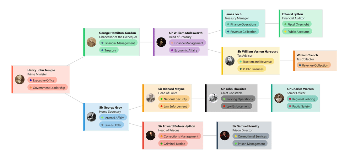
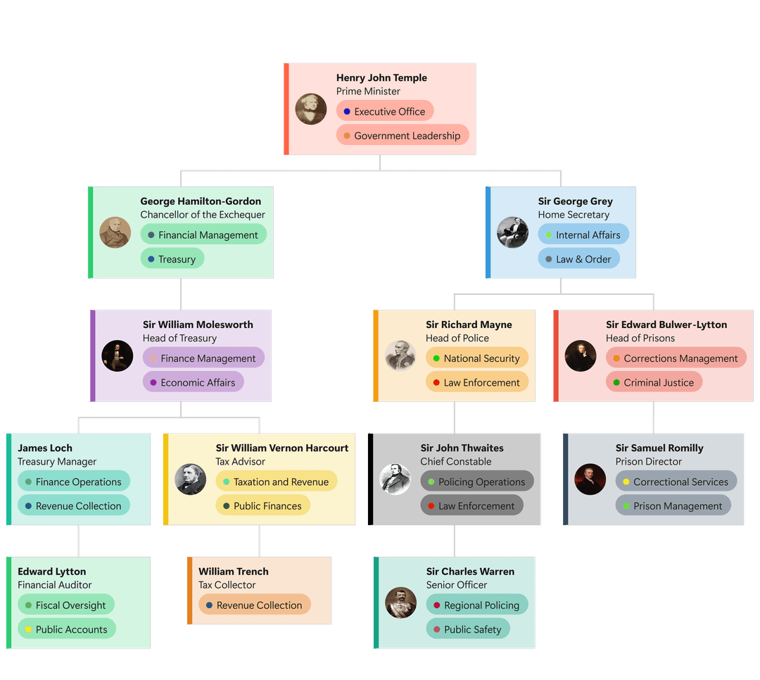
With the Visio Data Visualizer add-in being deprecated, I lost an easy way to turn Excel tables into organograms.
So I built a small web tool that lets you paste a table from Excel and instantly generate an organogram:
https://cll-software.github.io/Organogram-Maker/
Colours are fully user-defined, but I’m looking for feedback on everything else: layout, spacing, alignment, hierarchy, readability, and overall visual clarity.
It’s early and intentionally lightweight. I use this regularly for work, and I’d love design-focused, constructive feedback on how to make the output look cleaner and more “data-is-beautiful.”
by ForsakenElk1839
1 Comment
From a readability angle, the hierarchy comes through, but the vertical density feels a bit tight once you get past two levels. My eye jumps between columns more than it should, especially when similar colors repeat across branches. You might get a lot of clarity by increasing vertical spacing per level and slightly de-emphasizing the tag pills so names and roles dominate. Alignment is mostly clean, but consistent card widths per level could reduce visual jitter. Overall it already beats most Excel to Visio exports, it just needs a bit more breathing room to feel calm instead of busy.