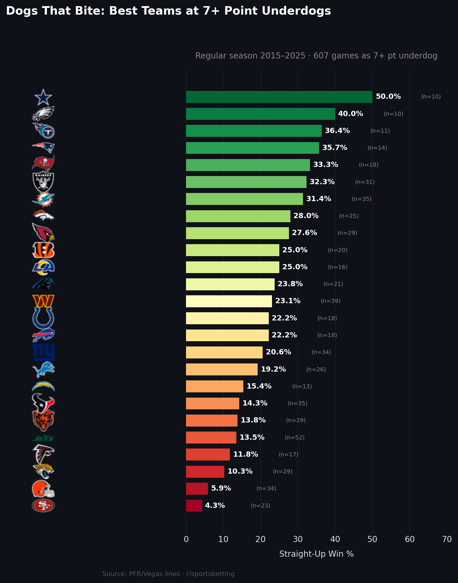
– Filtered regular-season games where teams closed as 7+ point underdogs
– Calculated straight-up win percentage by team (not ATS)
– Included total sample size per team directly in the visualization
– Visualization generated programmatically from the cleaned dataset
Created while debugging and validating the data pipeline. Was pretty suprised to see how hight the win% got for some teams.
FriendAleks on
I for one, think this is a great chart. Beautiful even.
enfuego138 on
Do missing teams just have a 0% success rate? Or maybe we’re never 7 point underdogs? Both seem unlikely over ten years.
nightkingscat on
why are only 25/32 teams included
TheGlobalVar on
Does this mostly correlate with the average spread in those games? As in the better performing are typically right around 7 while the worse ones are 10+

5 Comments
Data source:
Regular-season NFL game results and closing point spreads from Pro-Football-Reference, covering the 2015–2025 seasons.
Tools used:
Custom Python data pipeline and analysis code from my open-source repository:
[https://github.com/thadhutch/nfl-data-pipeline](https://github.com/thadhutch/nfl-data-pipeline)
Methodology:
– Filtered regular-season games where teams closed as 7+ point underdogs
– Calculated straight-up win percentage by team (not ATS)
– Included total sample size per team directly in the visualization
– Visualization generated programmatically from the cleaned dataset
Created while debugging and validating the data pipeline. Was pretty suprised to see how hight the win% got for some teams.
I for one, think this is a great chart. Beautiful even.
Do missing teams just have a 0% success rate? Or maybe we’re never 7 point underdogs? Both seem unlikely over ten years.
why are only 25/32 teams included
Does this mostly correlate with the average spread in those games? As in the better performing are typically right around 7 while the worse ones are 10+