
full version here: anita.garden/assets/maps/nycarea.png
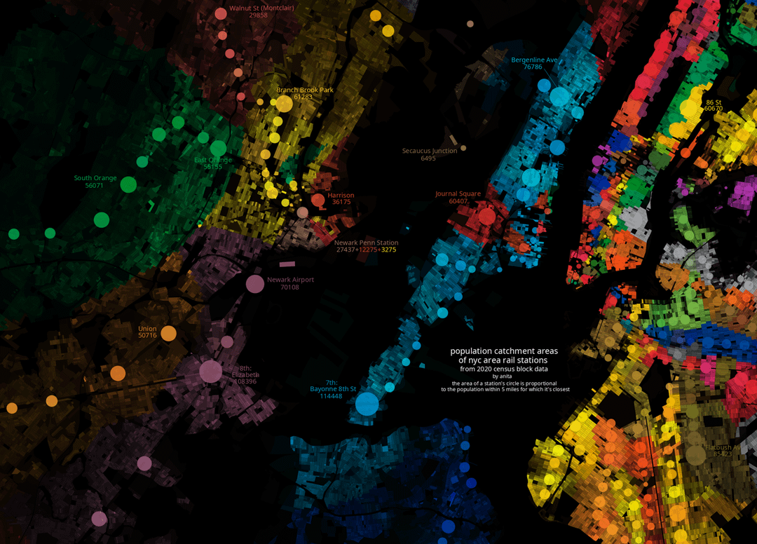
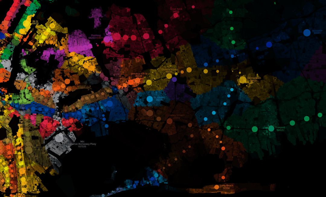
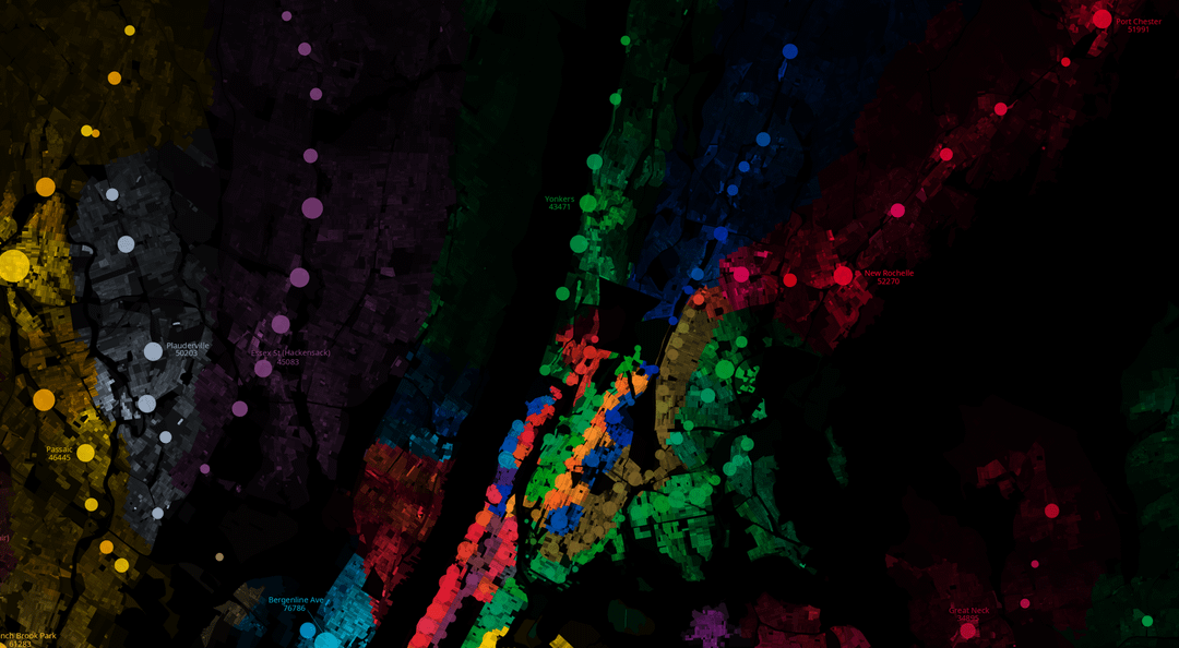
the size of each station's bubble is proportional to the population in the city for which it's the closest station. this is a sort of proxy for transit deserts. note that the size of the bubbles have nothing to do with actual ridership.
you can check out my other maps here! anita.garden/projects/ i have a version with just the nyc subway.
by minecraftian48
2 Comments
population data is 2020 census block data. tools are matplotlib, and asesprite for labelling.
Mods, why was this deleted?