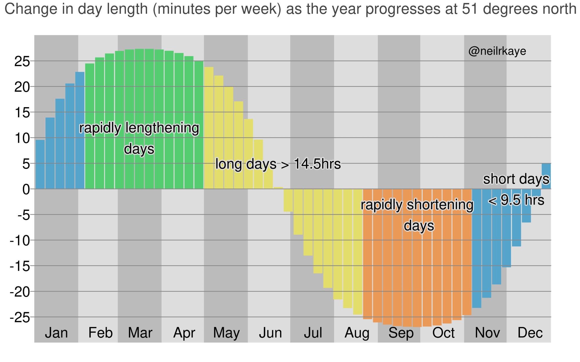
Created using ggplot2 in R and the data I made myself using the R geosphere package.
pocketdare on
I suppose you’d have a very similar chart if you simply plotted minutes of daylight, but with different y-axis and a roughly 90 day time shift. And yet, that would seem more intuitive to me as that’s basically the way I think about seasonal variations.
thealgernon on
Never seen this visualized like this before. Amazing!
Kaister0000 on
I saw another post a while back showing the same thing, but instead of a bar graph it was a line graph that showed a few different latitudes. [suncalc.org](http://suncalc.org) is also another cool site to visualize the location of the sun at different times of the year.

4 Comments
Created using ggplot2 in R and the data I made myself using the R geosphere package.
I suppose you’d have a very similar chart if you simply plotted minutes of daylight, but with different y-axis and a roughly 90 day time shift. And yet, that would seem more intuitive to me as that’s basically the way I think about seasonal variations.
Never seen this visualized like this before. Amazing!
I saw another post a while back showing the same thing, but instead of a bar graph it was a line graph that showed a few different latitudes. [suncalc.org](http://suncalc.org) is also another cool site to visualize the location of the sun at different times of the year.