
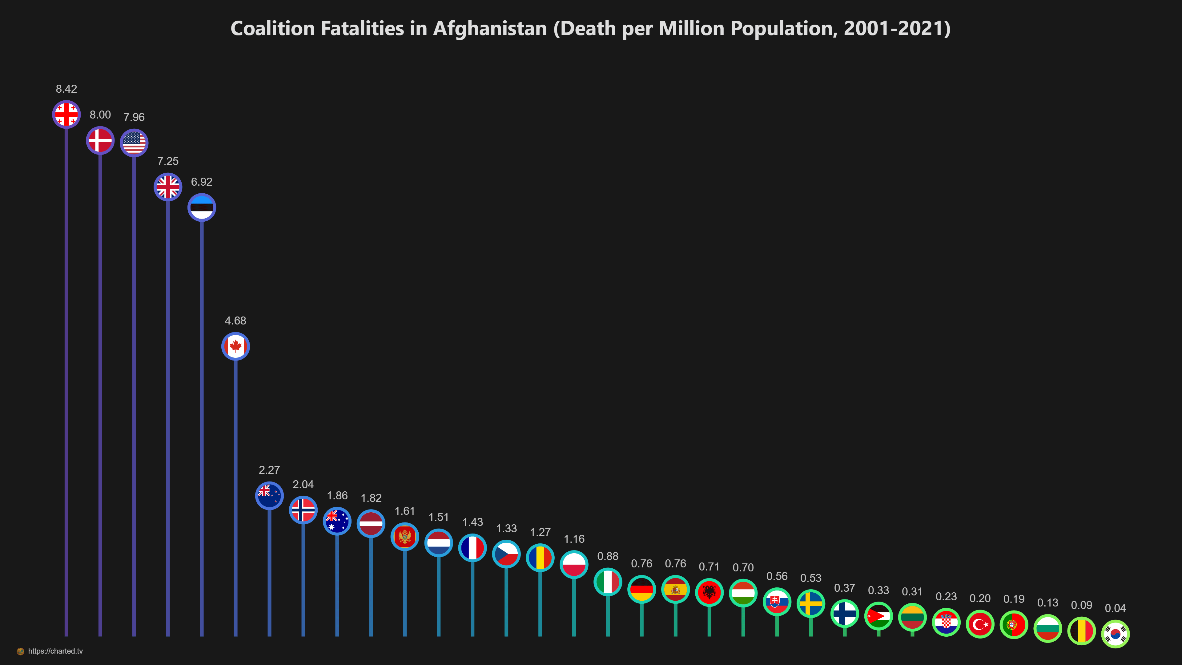
I posted the absolute numbers a couple of days ago: Coalition casualties in Afghanistan.
Many people asked for a per-capita view — here it is.
I’ve used fatalities rather than casualties for precision.
No legend included; the flags should be self-explanatory.
by chartedtv
11 Comments
This might be a stupid complaint but wouldn’t it make sense to, instead of a per-capita chart, doing a per-soldier sent chart? Anyway you graph looks pretty.
“we invaded a country and it made our soldiers sad” – graph version
For those confused as to why it appears the UK is on there twice: the first line actually represents Georgia, not the UK. The way the flag is cropped into these circles makes it hard to tell at a glance.
Oh look, our good friend Denmark lost a larger part of their population avenging an attack on the United States. So yes anyway let’s threaten to invade them so we can secure land we already have uninhibited military access to.
What’s the deal with Denmark? Why are they always so eager to follow USA into wars that are not theirs?
should make per solider sent chart then we can make a ranking of who has the best trained soldiers
The British army paying a blood price for MOD pennypinching
I don’t mean to be offensive or ignorant, but I didn’t even know Georgian forces were there. Why are the fatalities so high for them? (Besides having a small population)
A bit random stat as population has nothing to do with how many soldiers different countries had there. More interesting it would be to see deaths per soldiers sent to Afghanistan
now control for American friendly fire.
For Spain, there was a plane crash that killed 63 military personnel that brings the total deaths much higher. I think it should be counted.
https://es.wikipedia.org/wiki/Vuelo_4230_de_Ukrainian-Mediterranean_Airlines