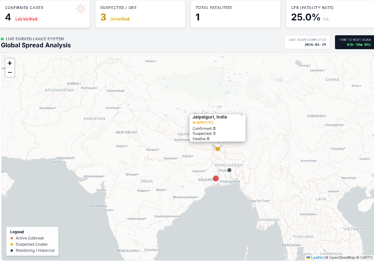
Source: Aggregated reports from local Ministry of Health bulletins and WHO. Tool: Custom dashboard built with LeafletJS and Cloudflare Workers.
I built this because official data sources are currently lagging behind local news reports by 24-48 hours. This visualization separates ‘Confirmed’ (Red) from ‘Suspected’ (Orange) clusters to ensure accuracy.
Thanks for sharing.
Admittedly the news about this hasn’t reached me yet.
Out of curiosity, would you be willing to share sources, e.g. via GitHub? This looks like a nifty project that could be reused for other topics as well.

2 Comments
Source: Aggregated reports from local Ministry of Health bulletins and WHO. Tool: Custom dashboard built with LeafletJS and Cloudflare Workers.
I built this because official data sources are currently lagging behind local news reports by 24-48 hours. This visualization separates ‘Confirmed’ (Red) from ‘Suspected’ (Orange) clusters to ensure accuracy.
Live version available here:[https://nipahwatch.com](https://nipahwatch.com)
Thanks for sharing.
Admittedly the news about this hasn’t reached me yet.
Out of curiosity, would you be willing to share sources, e.g. via GitHub? This looks like a nifty project that could be reused for other topics as well.