
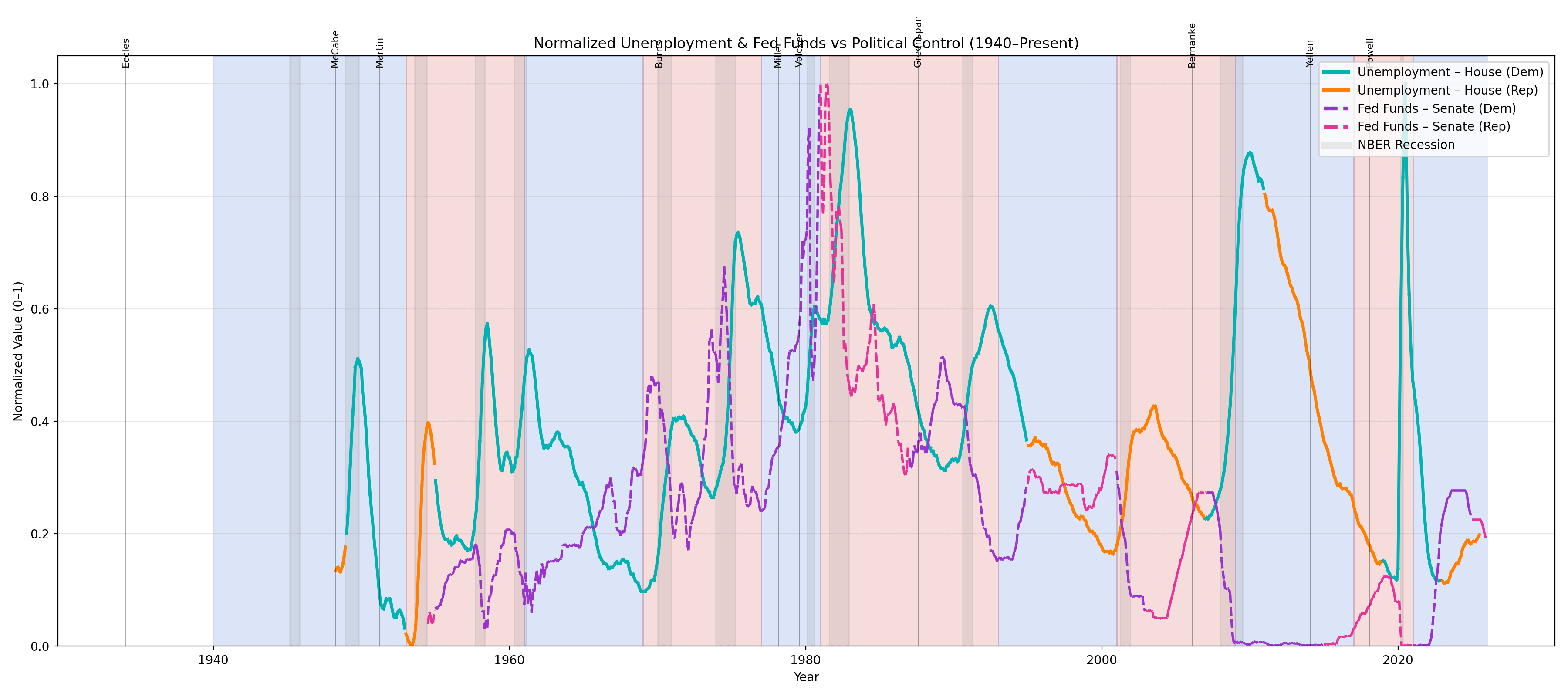
This graph has a lot of data in one place. I tried to stream line as much as possible. I have normalized the fed rate and the unemployment rate just to make it easier to read. But the colors on the unemployment rate are house party control. The colors on the fed rate is the controlling party in the senate and the background colors are the presidential party. The fed chairs is annotated at the top.
by maineac