
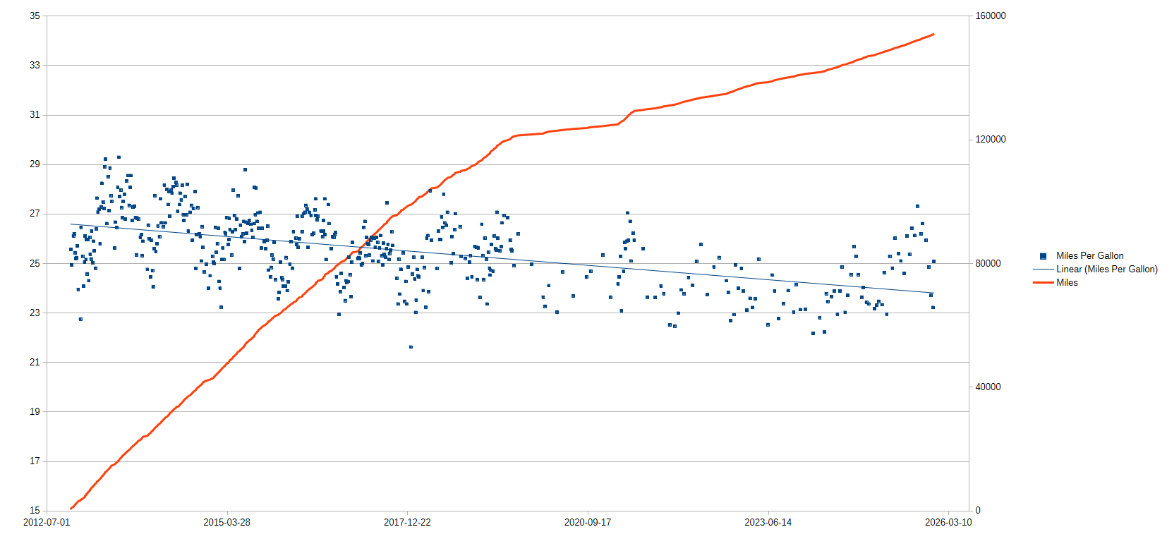
I have been using an app on my phone where I enter Odometer, Gallons of Fuel, and Price per Gallon every time I fuel up the car since I bought my car in November 2012. The left Y-axis is Miles Per Gallon and the right Y-axis is Miles recorded from the Odometer.
I exported the data from the app to a csv file and created the graph with LibreOffice Calc.
by i8SuspiciousCheese
5 Comments
Is that a working-from-home elbow on the red line?
You’re incredibly disciplined if you’ve been filling it out manually for so many years
Clearly a downward trend with your MPG. Curious what kind of oil you’re using and if you got regular tuneups completed, i.e. spark plugs, fuel filters, air filter cleaning, etc.
Car details? Year, Make, Model, Trim, Engine, Transmission?
Mind sharing these data? These would be a great case study in Gaussian processes for a class I’m teaching