
Hi all.
This is an exploratory visualization I’ve been working on.
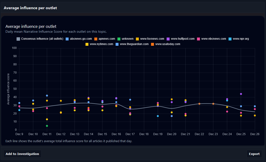
The chart shows the daily average influence score for major U.S. news outlets covering U.S. congressional politics over a two-week period.
The metric isn’t measuring factual accuracy or political bias. Instead, it aggregates signals like language intensity, framing, emphasis, and narrative structure to estimate how strongly coverage may shape reader perception on a given day.
Each colored series represents an outlet’s daily average across all articles it published on this topic; the gray line reflects the cross-outlet mean.
I’m mainly posting this to get feedback on the visualization and concept, whether this kind of cross-outlet comparison is intuitive, confusing, or useful, and how it could be presented more clearly.
Happy to answer methodology questions.
by NarrativeIndex
1 Comment
**Source:**
The data comes from my own aggregation of publicly available news articles from major U.S. outlets. Articles are programmatically collected, tagged by topic (in this case “U.S. congressional politics”), and analyzed daily. The values shown are daily averages across all articles each outlet published on that topic.
**Method / Metric:**
The “narrative influence” score is a composite metric derived from features like language intensity, framing emphasis, repetition, and structural narrative cues. It is **not** a measure of factual accuracy, bias, or political stance , only relative framing strength within coverage.
**Tool:**
Data processing and scoring were done in Python. The visualization itself was generated using a custom JavaScript charting setup (Chart.js) with some post-processing for clarity.
Happy to clarify methodology or answer visualization questions.