
Blockchain data is a mess to parse. So I built something to fix that.
I've been working on visual transaction mapping which turns complex on-chain activity into something you can actually understand at a glance, not after 30 minutes of detective work.
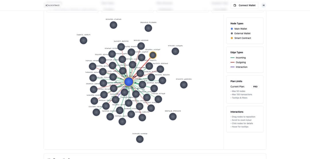
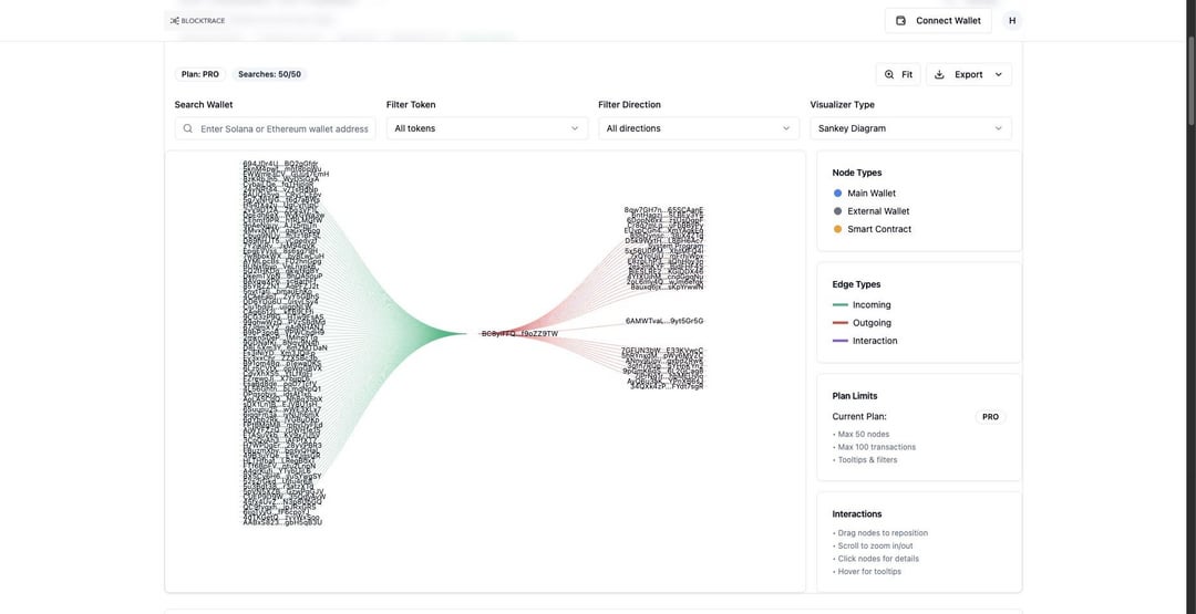
Here's what it looks like in action 👇
This shows fund flows mapped out visually, where money's coming from, where it's going, and the relationships between wallets that usually stay hidden in raw explorer data.
I'd love your take on a few things:
Is it clear? Can you follow the flow without me explaining it, or is something confusing?
Design-wise, does it feel intuitive? What would you change?
What's missing? If you were using this for your own analysis, what would make it more useful?
Still iterating on this, so honest feedback (even brutal) is incredibly valuable. If this resonates, I'm happy to share more about how it works.
by btems3