
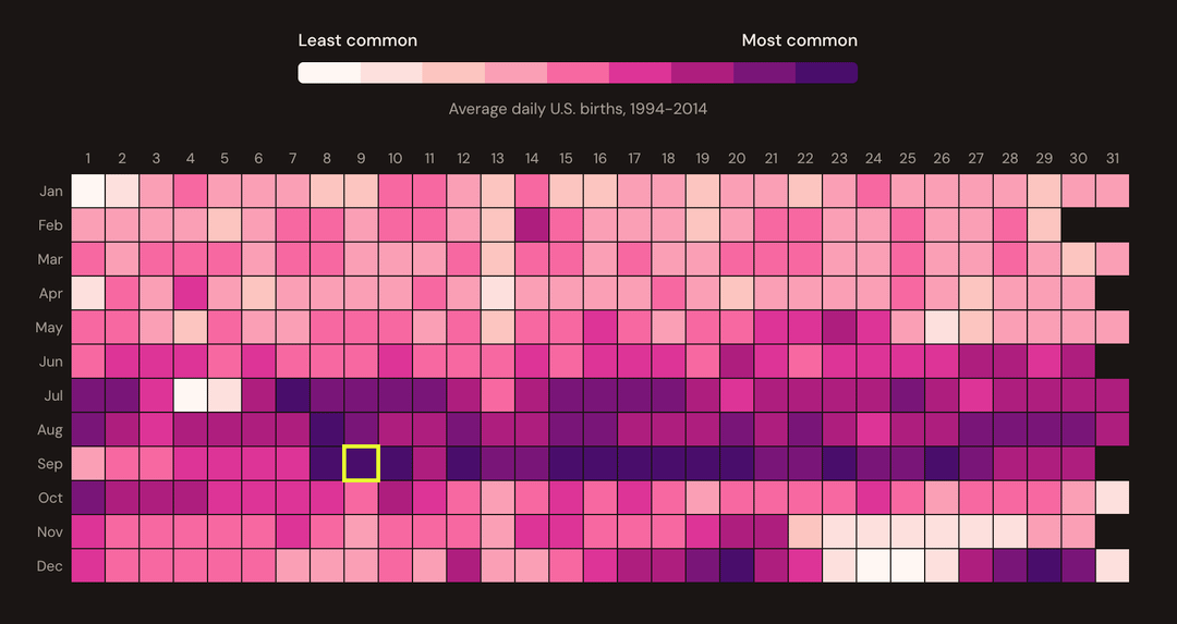
Back in the early 2010s, I made a static heatmap showing birthday popularity that got picked up widely – it even made it into Best American Infographics. But the criticism was valid: I'd colored by rank, not actual birth counts, which exaggerated the differences between dates.
A few years later, I rebuilt it with actual birth data from FiveThirtyEight. Better, but still static.
Now I've finally made what I'd consider the "proper" version: fully interactive, responsive, with features I always wanted to add.
What's here:
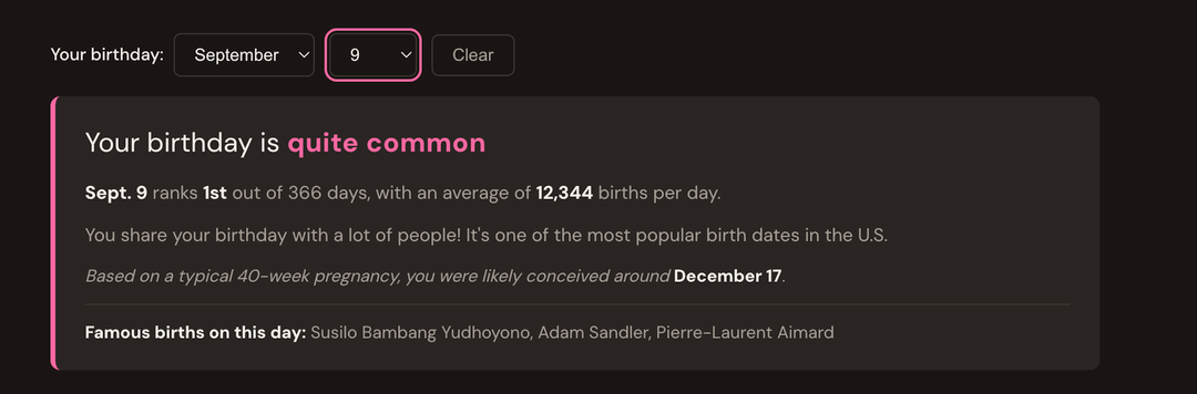
- Interactive heatmap (click or select any date to see its rank)
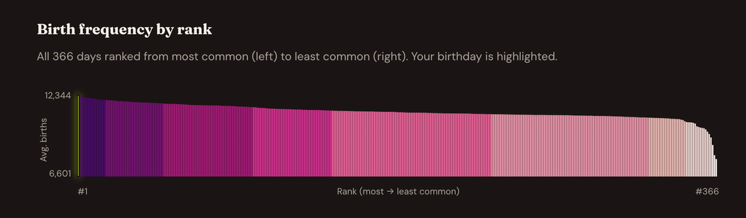
- Distribution chart showing all 366 days ranked
- Compare your birthday with a friend's
- Zodiac sign breakdown (Virgos dominate, unsurprisingly)
- Famous people who share your birthday
Key findings:
- Sept. 9 is the most common birthday (conceived around the holidays)
- Christmas, Christmas Eve, and New Year's Day are the rarest
- The data is left-skewed: most dates cluster around 11,000 births/day
Built with SvelteKit and D3. Data: CDC NCHS and SSA via FiveThirtyEight (1994-2014).
by mattstiles
5 Comments
Tools: SvelteKit, D3.js
Data source: FiveThirtyEight] (CDC NCHS 1994-2003, SSA 2000-2014)
[https://github.com/fivethirtyeight/data/tree/master/births](https://github.com/fivethirtyeight/data/tree/master/births)
Link: [https://birthdayrank.com](https://birthdayrank.com)
I am surprised to learn that my birthdate of Feb 29 is NOT the rarest birthday in the ranks. Crazy.
Edit: There has to be skewing of the data due to medical intervention.
Still interesting.
I remember exploring that 2016 version years ago. Nice to encounter the creator out in the wild! And well done on the latest iteration
Very cool. I’m curious, where do you get the data for famous people’s birthdays and how are they selected?
I would expect Beyonce to be listed as a famous person born on Sept 4th. She’s not listed, and I haven’t a clue who the other folks are (i.e., Anthony D Weiner, Bernard B Kerik, Raymond W Kelly).
Edit: refined initial question
Hello fellow new years babies