
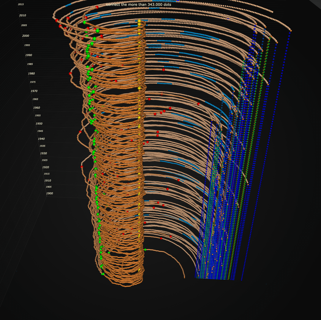
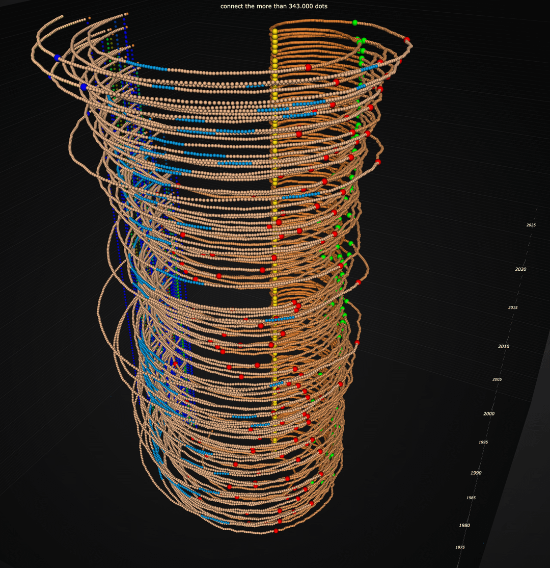
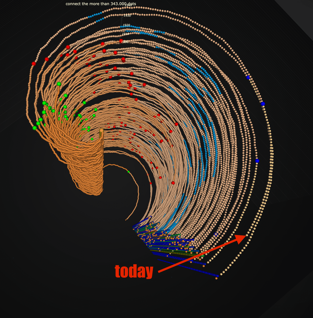
A year starts at the center, setting hours of sunshine to zero and accumulating over time. A complete cirkel is 365 days. Vertical blue dotted lines are end year totals records. Bigger spheres in green / red / blue are 800 / 1200 / 2000 hours of sunshine marks. blue lines are long term year averages. The model is 3D and rotatable at 60fps. The Netherlands is getting sunnier!
by Technical-Lab2666
3 Comments
Sorry but this is an abysmal way of showing this data
I think this was cool to build and would be fun to explore in 3D, OP. But I would not say it’s exactly an efficient way of visualizing these stats just from the screenshots you posted
This is exceedingly confusing. A simple scatter plot would convey the same message (the Netherlands is getting sunnier).
But then who would post a simple scatter plot in r/dataisbeautiful 😂