
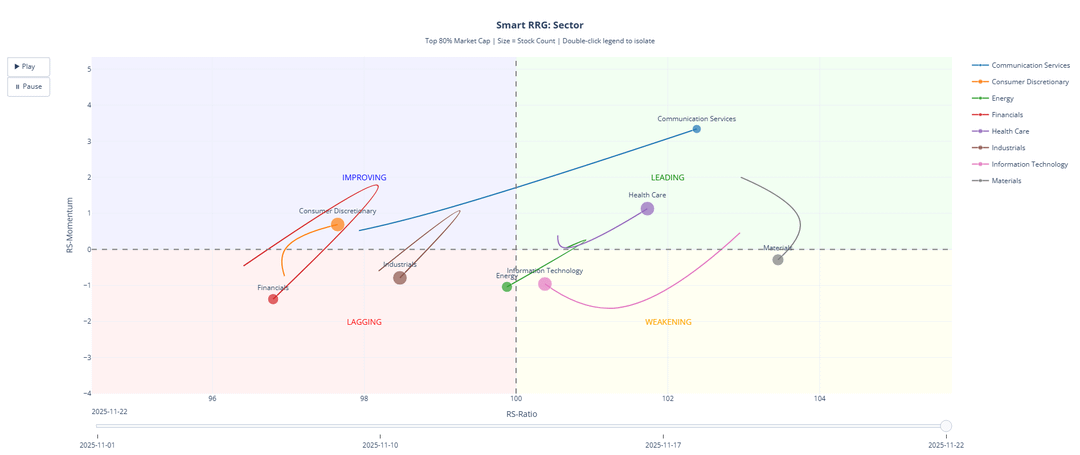
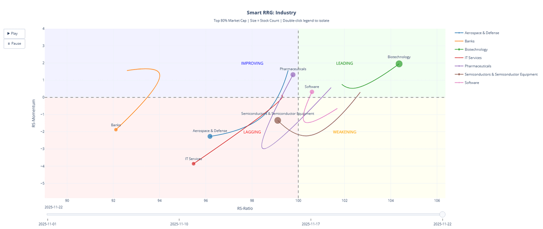
I built an interactive market rotation analysis tool using Relative Rotation Graphs (RRG) to track 500+ stocks across sectors, industries, and sub-industries.
🔗 LIVE DEMO – Click to Explore Interactive Charts
What it shows:
- Which sectors are gaining/losing momentum relative to the market
- Industry-level rotation patterns
- Sub-industry granular analysis
- Custom thematic trends
How it works:
The visualization plots groups on two axes:
- X-axis (RS-Ratio): Relative strength vs benchmark
- Y-axis (RS-Momentum): Rate of change in relative strength
This creates 4 quadrants showing rotation patterns:
- 🟢 Leading: Strong & getting stronger
- 🟡 Weakening: Strong but slowing
- 🔴 Lagging: Weak & getting weaker
- 🔵 Improving: Weak but gaining momentum
Tech Stack:
- Python, Pandas, Plotly
- Weekly updates tracking RS ratings (0-100 scale)
Happy to answer questions about the methodology or implementation!
by 007_commonman