
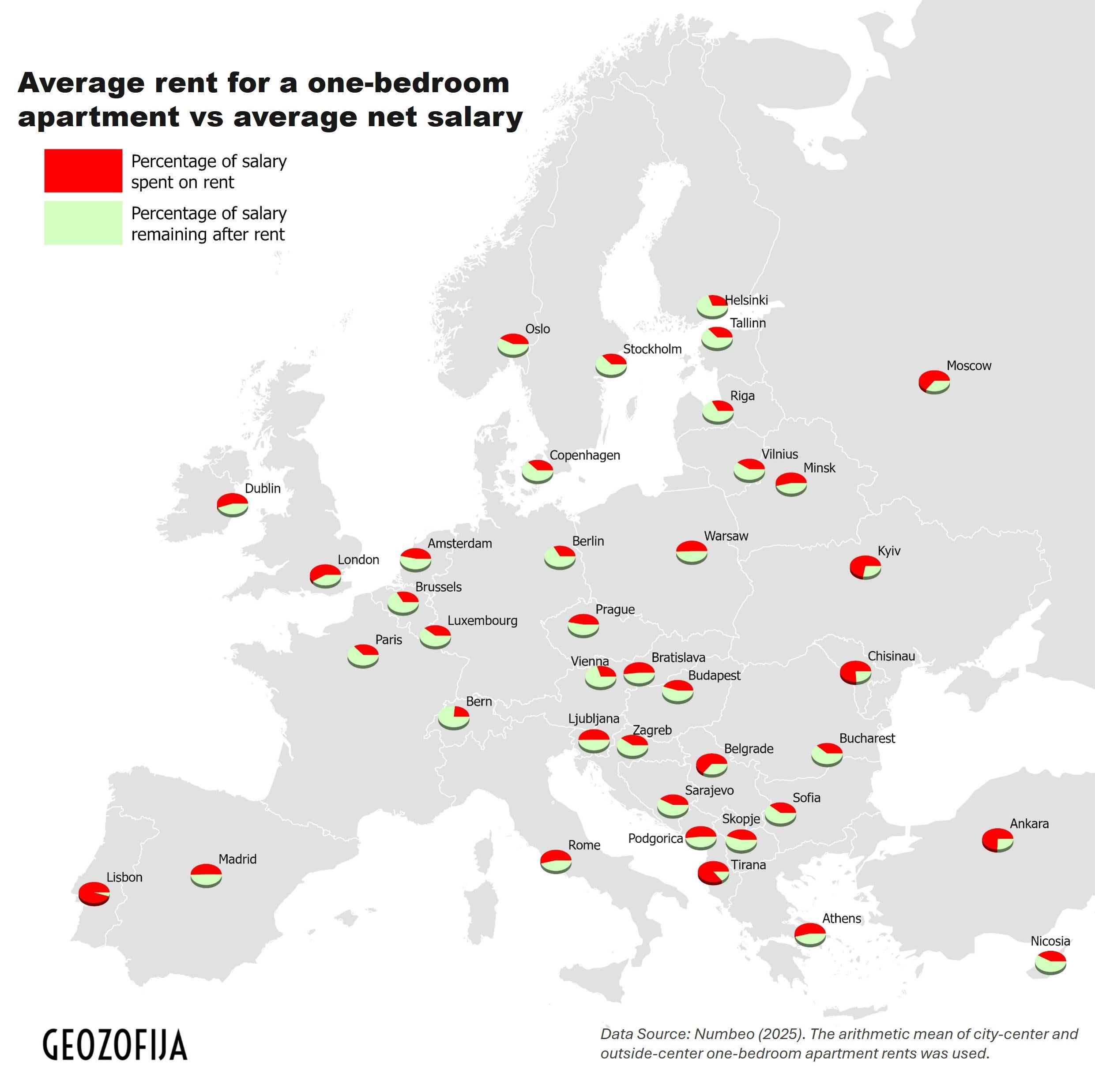
💡The analysis addresses the question of what proportion of the average salary must be allocated to rent a one-bedroom apartment at the average market price in the capitals of Europe.
🏡Rental housing is least affordable in Portugal, where nearly an entire monthly salary – 95% of the average wage – is required to rent a one-bedroom apartment. The most favourable conditions are observed in Bern, Switzerland, where such a rental accounts for 24% of the average salary.
🔗The complete analysis and detailed percentage values are provided below: https://www.geozofija.com/affordability-analysis-what-percentage-of-salary-is-spent-on-renting-a-one-bedroom-apartment-in-european-cities
🗂️Data: Numbeo (2025). Visualization: Geozofija. The map was created using ArcGIS Pro software.
📄 Media and editorial use are permitted with proper source attribution. For access to the underlying data or graphical materials, you may contact me.
by Geozofija
7 Comments
This data is hard to see, partly redundant and, in my eyes, decidedly not beautiful.
Is everyone is Lisbon bunking it with several other people?
With the Netherlands, it looks better than it is. Sure, the cost of an average 1 bed is around 47% of the average income, which doesn’t look too bad compared to eg London. But you are actually not allowed to spend more than ~30% of your income, landlords won’t accept anyone who can’t prove they earn 3-4x the rent. So a 1bed is solidly unaffordable
This would be great as a heat map and with significantly more cities included then general country & region trends could be seen
I find it hard to imagine a worse way of visualizing this. Minuscule 3D pie charts? Seriously?
(statistician here)
those are the capitals.
the cost of living in the capitals is likely a lot higher than living in cities.
so, the “average salary” would be more likely to simply, not live there.
so, it’s unlikely to be accurate.
average salary is also one of the worst metrics possible. median would be a lot better.
also : average of what ? of europe ? of the country ? of people living in the country ?
of salary ? of percentage of salary spent on rent ?
because (the average rent/the average salary) isn’t the same as the average (rent/salary). at all.
also, salary, or income ? those two are also very different concepts. in most countries, salaries don’t includes various bonuses. so, in a country with more bonuses than salaries, those graphs ain’t comparable.
does it include people who don’t pay for housing/receive subsidies for housing ?
if several people live in the same home, is the cost split between them ? ( one bedroom apartment doesn’t mean only one person lives there)
on the visualisation side : tiny pies ? some kind of heatmap would be a lot better imo
Just so you know OP, I like the visualization. I had seen the data yesterday in a different format. This one also works.