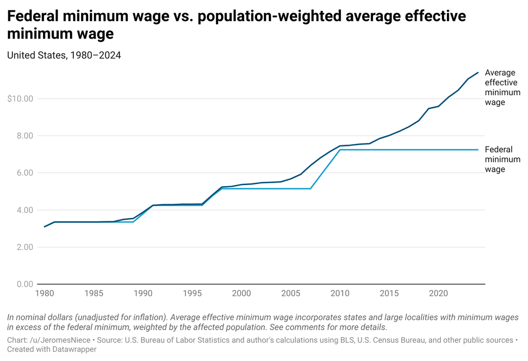

[OC] U.S. federal minimum wage vs. population-weighted average effective minimum wage by year
by JeromesNiece

[OC] U.S. federal minimum wage vs. population-weighted average effective minimum wage by year
by JeromesNiece
6 Comments
Average effective minimum wage is a population-weighted average of effective minimum wages, including states and large localities with minimum wages in excess of the federal minimum for that year. I.e., if a state or locality has a minimum wage in excess of the federal minimum, that figure is used, otherwise, the federal minimum is used.
I included all 50 states (plus DC) in the dataset and the following 16 localities (cities or counties), representing the largest localities by population with minimum wages in excess of their state’s minimum wage (all those with population of 500,000 or more):
* New York City
* Los Angeles
* Chicago
* San Diego
* San Jose
* San Francisco
* Seattle
* Denver
* Tucson, Arizona
* Los Angeles County, California (less Los Angeles city)
* Portland Urban Growth Boundary, Oregon
* Suffolk County, New York
* Nassau County, New York
* Montgomery County, Maryland
* Westchester County, New York
* San Mateo County, California
For each locality, I weighted by the affected population for that year, i.e., the state or county minus the populations of other localities included in that locality in the data set that year.
Wages represent the minimum rate for non-tipped employees as of January 1 of that year. If different rates were set for small and large employers in the locality, the rate for large employers was used.
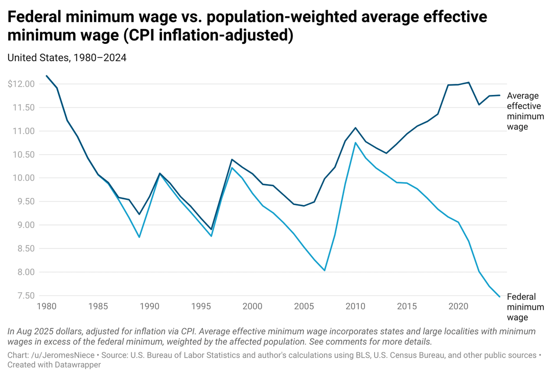
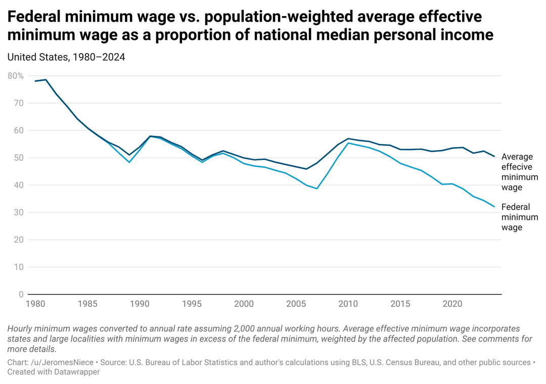
The first chart is in nominal dollars, the second chart is the same data adjusted for inflation via CPI-U (consumer price index for urban consumers) in August 2025 dollars, the third chart is the same but adjusted for inflation via the personal consumption expenditures chain-type price index in August 2025 dollars, and the final chart is the same data expressed as a proportion of the national median annual personal income. For the last chart, hourly minimum wage were annualized by assuming 2,000 annual work hours.
[Nominal dollars data link](https://www.datawrapper.de/_/3si1Z/)
[CPI-adjusted dollars data link](https://www.datawrapper.de/_/dd1I5/)
[PCE-adjusted dollars data link](https://www.datawrapper.de/_/H0mNG/)
[As a proportion of national median personal income data link](https://www.datawrapper.de/_/7YEhh/)
[Full yearly data link](https://www.datawrapper.de/_/fKXRb/)
Data sources include:
[Minimum Wage Tracker by The Economic Policy Institute](https://www.epi.org/minimum-wage-tracker/?utm_source=chatgpt.com#/min_wage/)
[U.S. Department of Labor: Changes in Basic Minimum Wages in Non-Farm Employment Under State Law: Selected Years 1968 to 2024](https://www.dol.gov/agencies/whd/state/minimum-wage/history)
Cool data and nice visualization! I feel like people focus on the federal minimum wage a lot without thinking about local minimum wages, so this is a cool chart to see.
Interesting idea, would be cool to see by city or adjusted by cost of living
Almost as if the Federal one is a minimum floor, but each location is allowed to set their own higher.
It’s unfortunate that the middle two graphs start at $7.50, while the first and last graphs start at zero.
Interesting perspective, although I’m not quite sure what it tells us by comparing the two. They seem like fundamentally different measures.