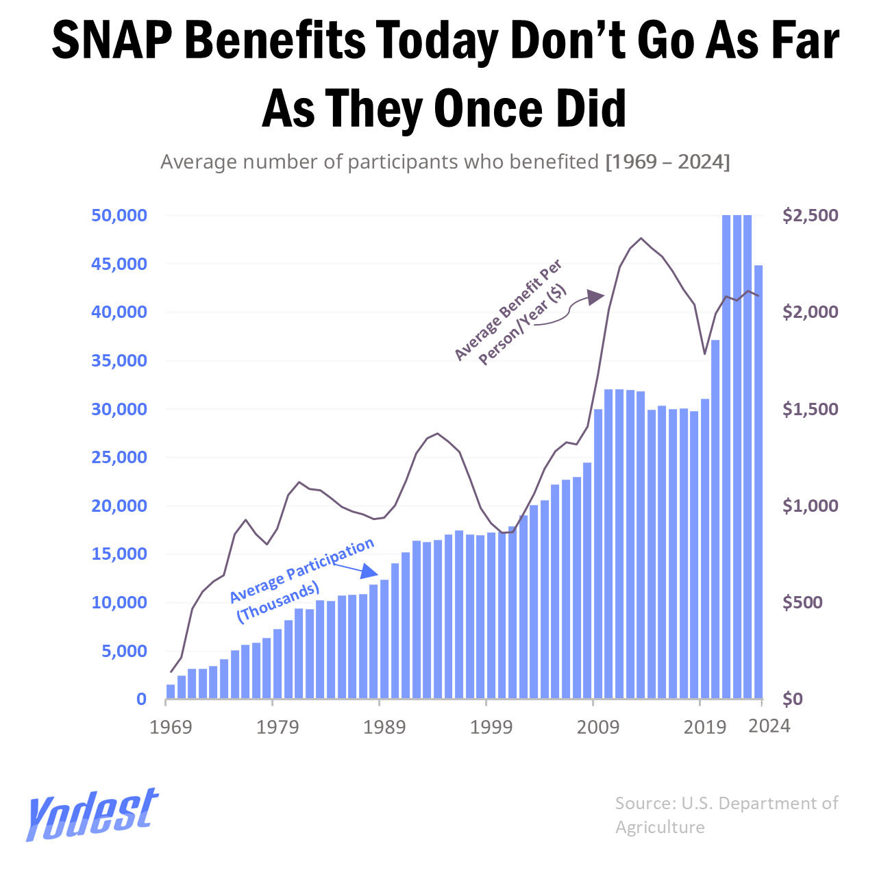
It is not clear if the dollar values are inflation adjusted or not…. I would guess not?
iguessimdepressed1 on
I think of it was adjusted for inflation the graph would be going down instead of up :-p
wdmartin on
According to this chart, in 2024 there were about 45,000 SNAP recipients, which is off by an order of magnitude. According to [readily available data from the USDA](https://www.ers.usda.gov/data-products/chart-gallery/chart-detail?chartId=55416), “In fiscal year 2024, the Supplemental Nutrition Assistance Program (SNAP) served an average of 41.7 million people per month.”
I think perhaps you’ve accidentally mislabeled the units on the left axis. Those should be millions, not thousands.
tombob51 on
I am going to try to offer constructive feedback here. Make sure your subtitle is correct (average number of participants *in thousands*). Make sure your axes cover the full data, it appears to be cut off at 50,000. Adjust prices for inflation.
But far more importantly, how does the data you’ve presented justify that SNAP benefits don’t go as far as they once did? If anything, it shows the opposite: SNAP serves more people than ever, and pays out more per person than ever. Probably because you didn’t adjust for inflation. Your data has to justify the title, ideally in a very clear/obvious way. But either way, you should also DESCRIBE (e.g. in a comment) how/why the data justifies the title. Or even better yet, just use a more objective title, and let people draw their own conclusions! For example: “Growth of SNAP benefits and participants (1969-2024)”
the_mellojoe on
Can we plot this against inflation, or percentage of population?

7 Comments
[Source](https://www.fns.usda.gov/pd/supplemental-nutrition-assistance-program-snap)
Tool: Excel
Are the benefits values inflation-adjusted?
It is not clear if the dollar values are inflation adjusted or not…. I would guess not?
I think of it was adjusted for inflation the graph would be going down instead of up :-p
According to this chart, in 2024 there were about 45,000 SNAP recipients, which is off by an order of magnitude. According to [readily available data from the USDA](https://www.ers.usda.gov/data-products/chart-gallery/chart-detail?chartId=55416), “In fiscal year 2024, the Supplemental Nutrition Assistance Program (SNAP) served an average of 41.7 million people per month.”
I think perhaps you’ve accidentally mislabeled the units on the left axis. Those should be millions, not thousands.
I am going to try to offer constructive feedback here. Make sure your subtitle is correct (average number of participants *in thousands*). Make sure your axes cover the full data, it appears to be cut off at 50,000. Adjust prices for inflation.
But far more importantly, how does the data you’ve presented justify that SNAP benefits don’t go as far as they once did? If anything, it shows the opposite: SNAP serves more people than ever, and pays out more per person than ever. Probably because you didn’t adjust for inflation. Your data has to justify the title, ideally in a very clear/obvious way. But either way, you should also DESCRIBE (e.g. in a comment) how/why the data justifies the title. Or even better yet, just use a more objective title, and let people draw their own conclusions! For example: “Growth of SNAP benefits and participants (1969-2024)”
Can we plot this against inflation, or percentage of population?
Or maybe normalize per capita?