
Original source: https://landregistry.data.gov.uk/app/ukhpi/browse?from=1970-01-01&location=http%3A%2F%2Flandregistry.data.gov.uk%2Fid%2Fregion%2Funited-kingdom&to=2025-09-01&lang=en
Data tools used: www.plotset.com
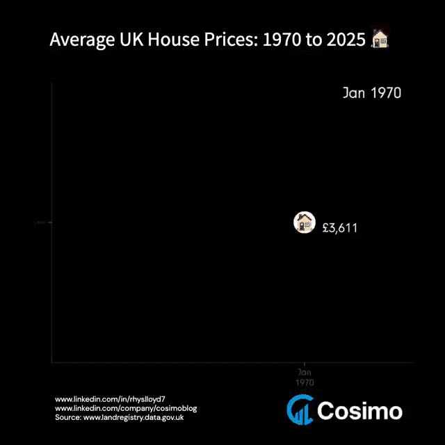
Description: Average UK house price from 1970 to 2025 on a quarterly basis
by rhyslloyd7
8 Comments
I’d like to see this graphed on top of the minimum wage throughout the years, just so I can justify my tears
Very cool – would be interesting to track inflation and average wages on the same graph, to see how the relationship to these basics has changed. Then broadcast it 24/7 on the BBC until boomers finally accept they might need to stop blocking new houses…
This would be a lot more useful if the house prices were adjusted for inflation.
Why would you make this a gif, instead of an animation with a time bar scroller?
No one’s talking about how house prices went from below 4k in 1970 to over 9k in 1975…
Somethings telling me peoples wages did not double in 5 years.
I think the problem is hoarding of houses but also “first come first serve” where most houses probably got bought out in the early 1970s causing supply to fall below demand therefore increasing house prices.
“First come first serve” is only possible if something big like a world war happens
Rookie numbers. [Look at Australia](https://tradingeconomics.com/australia/average-house-prices) ($1.02 million AUD as of June 2025, equivalent to £506,000)
It’s fine!!!!! It’s all gonna be fine
How do people buy a house that costs that much?