
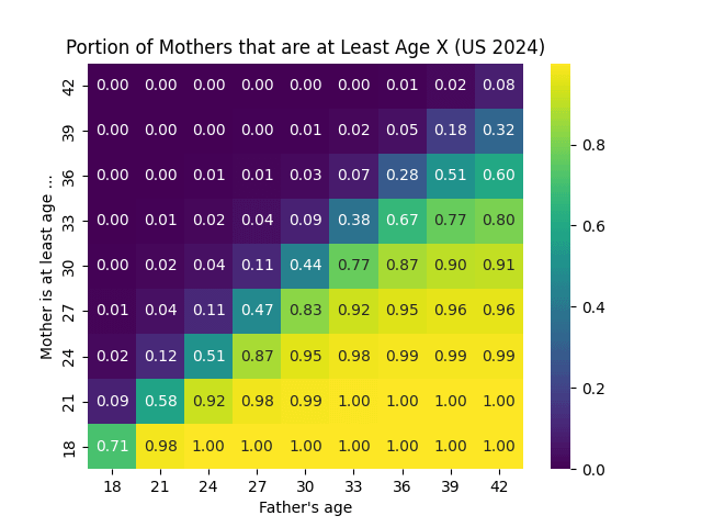
The goal of this plot is to determine, if a father is age X, what is the probability the mother will be at least age Y. The x-axis is the age of the father, the y-axis is the lower bound on the mother's age, and the value in the square shows the portion of US births in 2024 to fathers of age X where the mother is at least age Y (rounded to two decimal places). For example, in 92% of births where the father was 35 the mother was at least 28. I made this plot in Matplotlib, and the data is over the 3.6 millions births in the US from here. My overall goal is to see how common large age gaps are among parents of children, where in particular the father is older than the mother.
by lorisaurus
3 Comments
I guess sort of interesting though not sure what use case it would have. Also, not too sure why you decided to do mother is at least age instead of plotting actual age to actual age. That would be more intuitive imo and let you see quite easily both ways
The layout of this graph is very confusing.
Not beautiful, I have no idea what’s going on here