
**Data Source:** Agent-based modeling (500+ simulations) + empirical validation
**Tools Used:**
– Python (numpy, matplotlib, scipy)
– Lotka-Volterra competition equations
– Bootstrap confidence intervals for uncertainty quantification
**Methodology:**
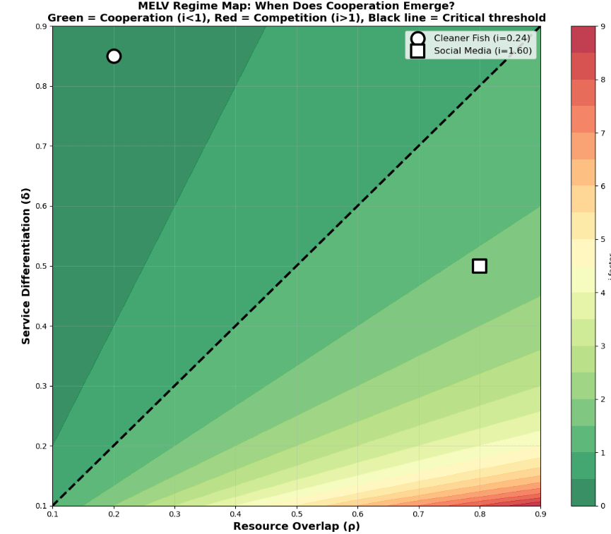
The i-factor = resource overlap / service differentiation
– i < 1.0 → cooperation emerges (green zone)
– i > 1.0 → competition dominates (red zone)
– i ≈ 1.0 → critical threshold (black diagonal line)
**Examples shown:**
– **Cleaner fish** (white circle, i=0.24): Low overlap (different food sources), high differentiation (parasite removal = survival) → Stable cooperation for millions of years
– **Social media** (white square, i=1.60): High overlap (same users/advertisers), moderate differentiation → Competitive conflict
**Validation:** r = -0.944 correlation between i-factor and cooperation emergence (p < 10⁻⁶, n=500)
The sharp color transition along the diagonal suggests cooperation vs competition isn't gradual—it's a phase transition.
**Interactive exploration:** https://naturesholismmelv.github.io/harmony/
**Open source:** https://github.com/NaturesHolismMELV/melv-core
by ecotao
5 Comments
I’ve read all the words but I don’t understand what this data is telling me.
Fish? Social media? Parasites? Cooperation, huh?
In a book I’m currently listening to, I heard, “It takes everyone to have peace, but only one asshole to have war.”
“sharp threshold”
I clearly see a smooth gradient.
There’s no sharp color transition. It’s a linear color scale from 0-9. Green dominates most of the plot, most of which is greater than your critical threshold.
Is this just bad visualisation or hallucinated AI slop, or is there where you learn you’re colorblind?
Looks like AI slop from the repo. The amount of misguided “science” that AI creates is going to be a real problem.
I have no idea what I’m even looking at? Fish? Social media??? Huhhh???