
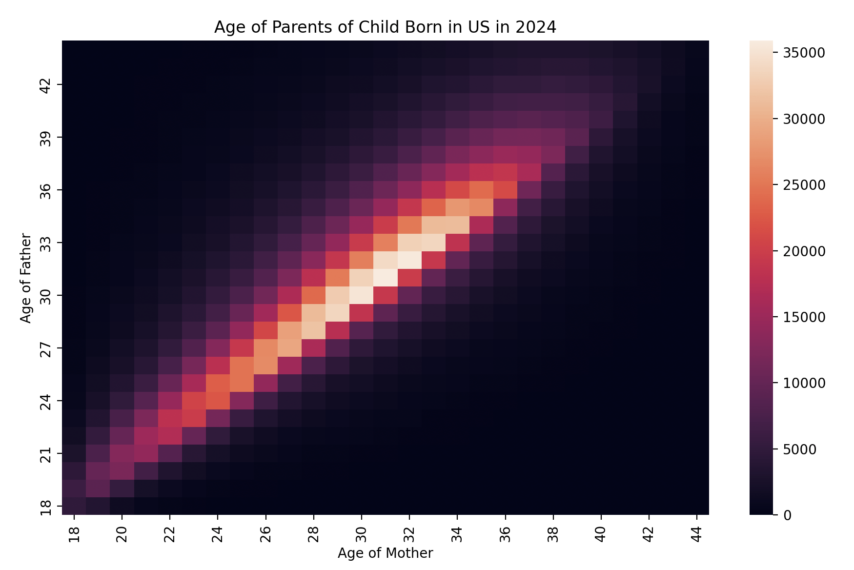
I made this plot using Matplotlib and the data from the US CDC vital statistics data which is publicly available here: https://www.cdc.gov/nchs/data_access/Vitalstatsonline.htm . The data is on the over 3.5 million births of children in the US in 2024.
The x-axis is the mother's age, while the y-axis is the father's age. The color depicts the number of births with that age pairing as depicted by the scale on the right. I find it very interesting how parents are so close in age, I guess I thought there would there would be more older man/younger women pairing with a more significant age gap (10+ years) but it turns out that's relatively rare.
by lorisaurus
2 Comments
would be interesting to see on a log scale imo
Shitty colors. Can’t easily differentiate 5000 from 0