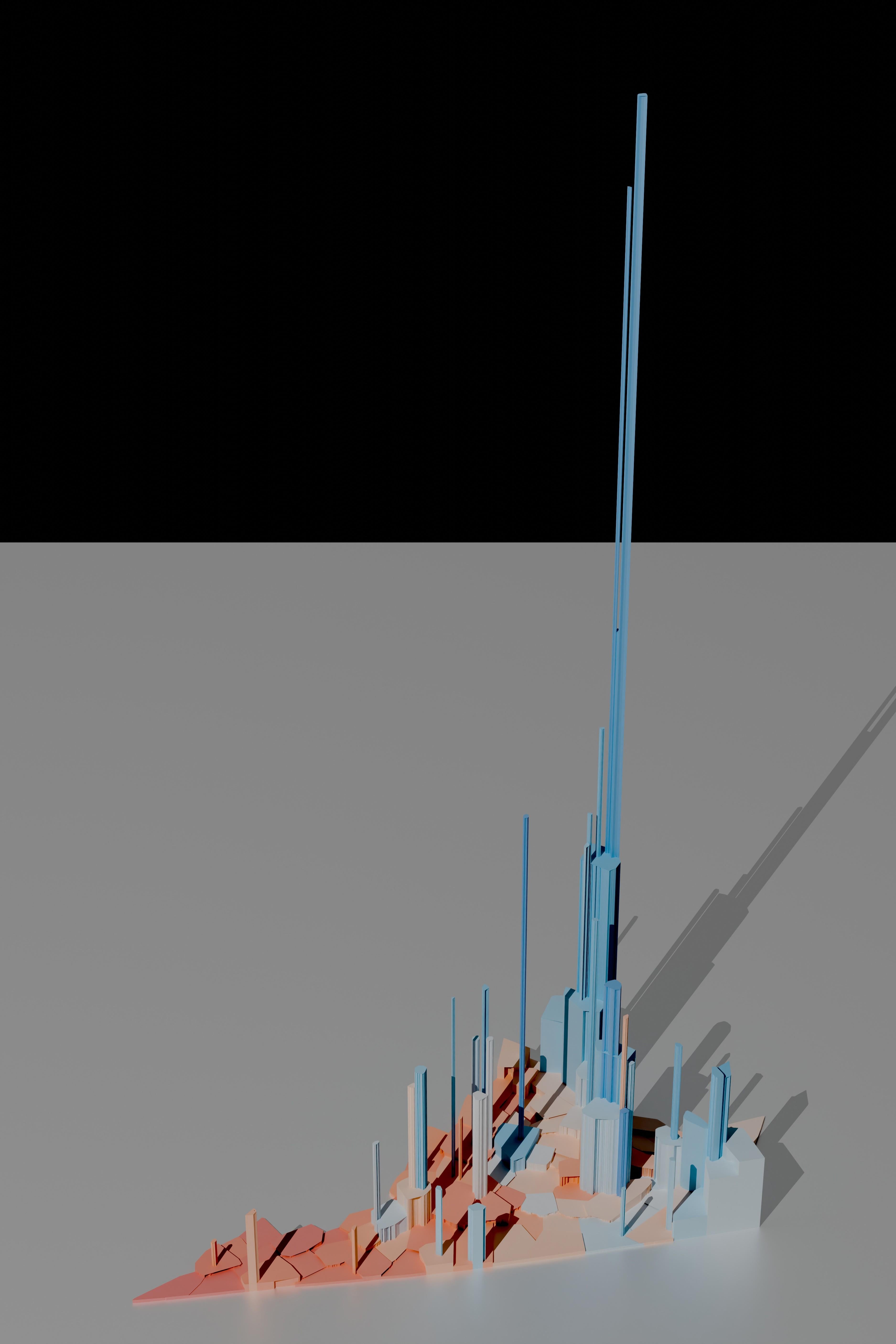
This is an attempt to correct several issues I’ve seen in election visualizations in American politics. By using volumetric representations of vote totals I maintain fidelity of both shape and position for each Virginia locality (Virginia cities are politically independent). Each locality is shaded to represent the margin of victory with a white mid-point; this prevents the eye’s bias towards red from taking over the map.
Rendering is in Blender. Anyone who wants to provide me with a materials and lighting tutorial suitable for a backend software engineer would be greatly appreciated.
cantonlautaro on
Soooo much red on the map…..some would say.
boofoodoo on
Pictured: why Republicans hate cities
KnotSupposed2BeHere on
The very tallest tower: is that Alexandria, Arlington, or something else?
Blrfl on
Nice work.
A similarly-interesting companion map would be one that shows tax dollars contributed to state coffers by each county and city. No idea where to get that data set, though.

5 Comments
This is an attempt to correct several issues I’ve seen in election visualizations in American politics. By using volumetric representations of vote totals I maintain fidelity of both shape and position for each Virginia locality (Virginia cities are politically independent). Each locality is shaded to represent the margin of victory with a white mid-point; this prevents the eye’s bias towards red from taking over the map.
Rendering is in Blender. Anyone who wants to provide me with a materials and lighting tutorial suitable for a backend software engineer would be greatly appreciated.
Soooo much red on the map…..some would say.
Pictured: why Republicans hate cities
The very tallest tower: is that Alexandria, Arlington, or something else?
Nice work.
A similarly-interesting companion map would be one that shows tax dollars contributed to state coffers by each county and city. No idea where to get that data set, though.