
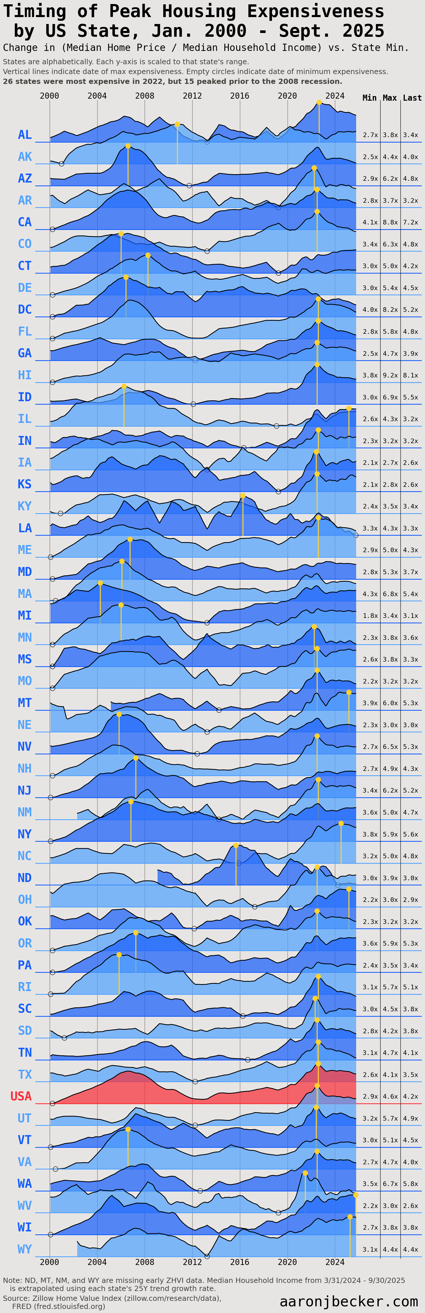
Housing expensiveness (proxied here as Median Home Value / Median Household Income) peaked for 26 states in 2022, but 15 fell short of their pre-2008 heights in the current cycle. Overall, states show similar trends despite vastly different base levels. Code and analysis: https://aaronjbecker.com/posts/twin-peaks-visualizing-expensiveness-trends/
Reposting because the insanity of my previous sorting method (by peak date) was brought to my attention.
by aar0nbecker
5 Comments
Data sources: [FRED Median Household Income by state](https://fred.stlouisfed.org/release/tables?eid=259462&rid=249), [Zillow Home Value Index](https://www.zillow.com/research/data/)
Tools: python, Jupyter, pandas, polars, matplotlib
Full code walkthrough, including some insane matplotlib contortions to get grid lines to plot behind multiple overlapping plots: https://aaronjbecker.com/posts/twin-peaks-visualizing-expensiveness-trends/
This would make a great tshirt
As a Wisconsinite, I feel this. We are the only ones who haven’t peaked yet!
These graphs that look like the Joy Division album cover always look awesome, although sometimes hard to read. This one lends itself really well though to comparing peaks in different states, nicely done. Interesting, although maybe not surprising, that most states either peaked around the housing crisis or pandemic.
Looks like Florida finally got some mountains! All we had to do is plot how unaffordable housing is getting here.