

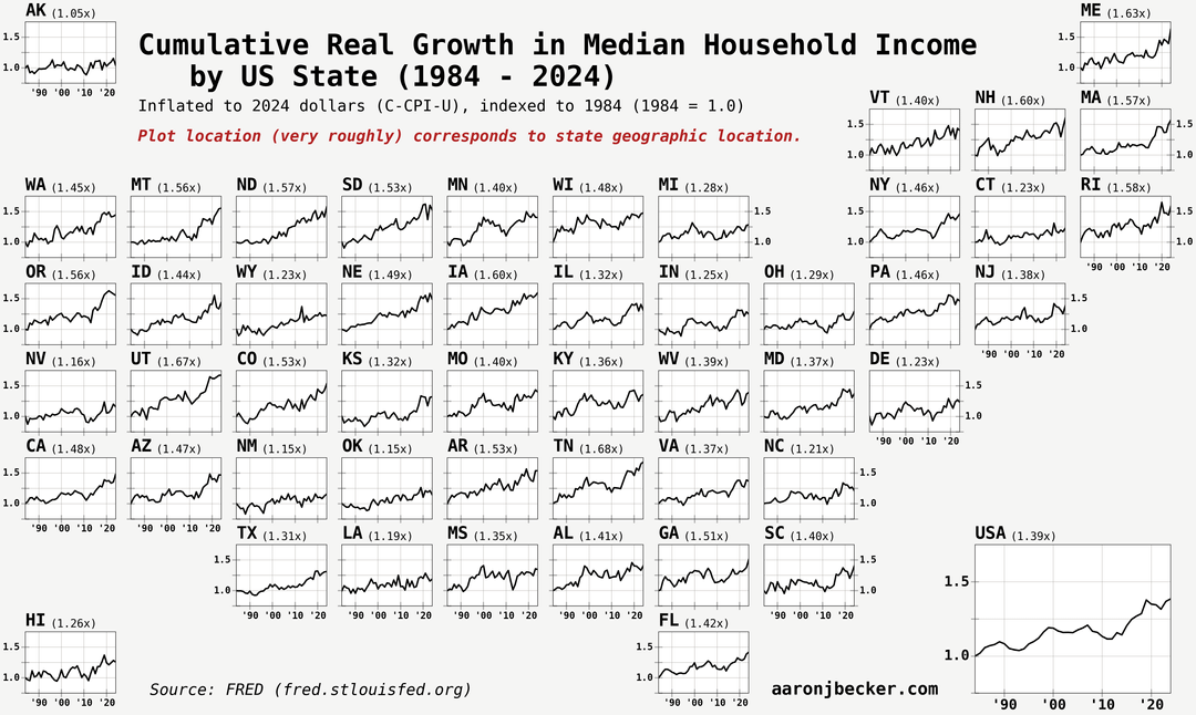
Swipe for grid cartogram with trends. Median household income is mostly relevant as a measure of housing affordability, since the only constant in what defines a household is living together. Code and analysis: https://aaronjbecker.com/posts/real-median-household-income-growth-by-state-since-1984/
by aar0nbecker
8 Comments
Data source: FRED ([link to table with all series](https://fred.stlouisfed.org/release/tables?rid=249&eid=259515))
Tools: python, pandas/polars, matplotlib, geopandas
[link to blog post with code walkthrough](https://aaronjbecker.com/posts/real-median-household-income-growth-by-state-since-1984/)
Reddit armchair economic experts on their way now to explain how this is wrong:
“Finally some good content”
But seriously, I find this well presented. I wish there was some incorporation of the absolute values, but otherwise very neatly done. I like plots.
It’s interesting to see how the mountain west seemed to be both more affected by the ’08 crash and overperform afterwards.
The interesting part of this is that there isn’t some obvious difference between regions like north vs south or east vs west. The highest 4 states are Utah, Iowa, Tennessee, and Maine, which are pretty spread out.
maybe kinda nitpicking here but the difference between “grew BY 1.5x” and “grew TO 1.5x” is not made very clear on the first map, although it is clear on the second map from context.
edit never mind its like, written right below the oclor bar but i still dont love it. i have no better suggestion really but could the wording of the title somehow make it more clear? idk. lazy reader here
I think the numbers should’ve been in % instead of ×. So like +67% for Utah instead of 1.67 times. Otherwise great map.
Per-state data is tolerable, but per-county data is better.
Income up by 53%; home prices up 129%; car prices up 140%; Cost of living up 200%. I see no problems here at all.