
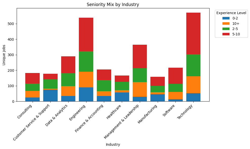
The chart shows how many roles fall into each experience bracket (0-2, 2-5, 5-10, 10+ years).
Some stuff stood out. Engineering and tech had the most mid-senior openings, while healthcare and customer service leaned more entry level.
idk I just thought it was interesting to see how the mix changes depending on the field.
For context, these roles came from a mix of ATS platforms — mostly Eightfold (303), Greenhouse (275), Paylocity (188), SmartRecruiters (148), and In-House postings (125).
Disclaimer: This is just a sample snapshot of the market for Oct 31st and doesn’t represent the entire job market.
by StepUpPrep
3 Comments
This is cool. I’d like to see another chart where the experience categories are expressed as percentages, with all the lines reaching one hundred.
This way it’s easier to compare industries. The total number of postings is less important. You could instead have a note saying that each industry had a minimum of 150 postings, or whatever it is.
Interesting data set. Did you consider looking at proportionately so that it’s easier to compare between fields? Also, the order 0-2, 10+,2-5, 5-10 isn’t as clear. Consider 0-2, 2-5, 5-10, 10+ instead
The ordering is off 10+ should be at the top of the legend. Nice otherwise.