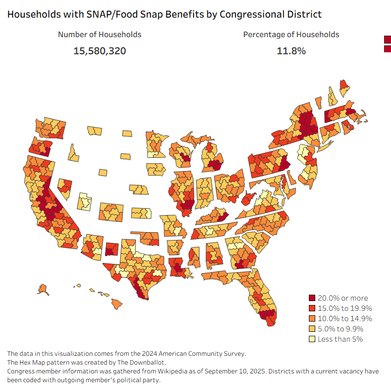
The data in this visualization comes from the 2024 American Community Survey.
The Hex Map pattern was created by The Downballot.
Congress member information was gathered from Wikipedia as of September 10, 2025. Districts with a current vacancy have been coded with outgoing member’s political party.
The visualization was created in Tableau.
Roughneck16 on
I was surprised to see the highest amount of SNAP dependency in Illinois’ most conservative region (the southeast.) However, when I clicked on the map, it turned out that the red dot actually represents IL-01, which is in Chicagoland.
However, the maps for Utah and New Mexico look a bit more accurate.
[ETA: the site gives you option to switch from a hex map to a real map.]
sullimareddit on
I checked FL, GA, and KY and all are 2:1 gop to dem recipients. Fascinating.
who_is_this_monster on
Wisconsin’s districts are wrong. Bryan Steil is not the 4th district representative
Roughneck16 on
Some observations:
* High dependency Republican areas tend to be rural districts in places like Appalachia and California’s Central Valley, which are socially conservative, but economically hard-hit. KY-05 in eastern Kentucky is a good example of an undiverse, coal-based economy that’s been left behind by modernization. Another district, OK-02 has a high population of rural Native Americans.
* Low dependency Republican areas are predominately white suburban districts, such as MO-02 which includes the southern, mostly-white side of the St. Louis metro. Utah, the perennial outlier of all maps like this, has a massive church that provides its members with a reliable support network in times of need. Also, avoiding drugs, alcohol, and nonmarital births is key to avoiding welfare dependency.
* High dependency Democratic areas include predominately African American districts like FL-24, which includes heavily black north Miami and LA-06, which was gerrymandered specifically to get as many black people into one district. MI-13, which includes some of the worst areas in Detroit, also fits this mold.
* Low dependency Democratic areas include affluent urban metros such as CA-17, which covers the South Bay and Silicon Valley.
rug1998 on
They’re attacking their own base lmao
vt2022cam on
Blue states created fewer barriers for signing people up than red states.
Turkino on
What’s the scale of the states being adjusted account for?
IE: Montana is a fairly large state by land area – significantly larger than Georgia which is shown here at 3x the size – but it’s shrunk down to tiny scale here, so I assume that’s to indicate something? Population would be my guess but I’d like to confirm.

8 Comments
The data in this visualization comes from the 2024 American Community Survey.
The Hex Map pattern was created by The Downballot.
Congress member information was gathered from Wikipedia as of September 10, 2025. Districts with a current vacancy have been coded with outgoing member’s political party.
The visualization was created in Tableau.
I was surprised to see the highest amount of SNAP dependency in Illinois’ most conservative region (the southeast.) However, when I clicked on the map, it turned out that the red dot actually represents IL-01, which is in Chicagoland.
However, the maps for Utah and New Mexico look a bit more accurate.
[ETA: the site gives you option to switch from a hex map to a real map.]
I checked FL, GA, and KY and all are 2:1 gop to dem recipients. Fascinating.
Wisconsin’s districts are wrong. Bryan Steil is not the 4th district representative
Some observations:
* High dependency Republican areas tend to be rural districts in places like Appalachia and California’s Central Valley, which are socially conservative, but economically hard-hit. KY-05 in eastern Kentucky is a good example of an undiverse, coal-based economy that’s been left behind by modernization. Another district, OK-02 has a high population of rural Native Americans.
* Low dependency Republican areas are predominately white suburban districts, such as MO-02 which includes the southern, mostly-white side of the St. Louis metro. Utah, the perennial outlier of all maps like this, has a massive church that provides its members with a reliable support network in times of need. Also, avoiding drugs, alcohol, and nonmarital births is key to avoiding welfare dependency.
* High dependency Democratic areas include predominately African American districts like FL-24, which includes heavily black north Miami and LA-06, which was gerrymandered specifically to get as many black people into one district. MI-13, which includes some of the worst areas in Detroit, also fits this mold.
* Low dependency Democratic areas include affluent urban metros such as CA-17, which covers the South Bay and Silicon Valley.
They’re attacking their own base lmao
Blue states created fewer barriers for signing people up than red states.
What’s the scale of the states being adjusted account for?
IE: Montana is a fairly large state by land area – significantly larger than Georgia which is shown here at 3x the size – but it’s shrunk down to tiny scale here, so I assume that’s to indicate something? Population would be my guess but I’d like to confirm.