
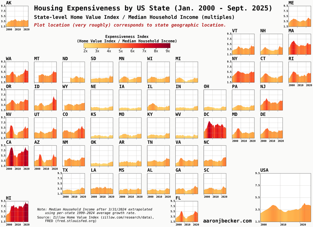
Plot location ≈ geographic location (swipe for alphabetical).
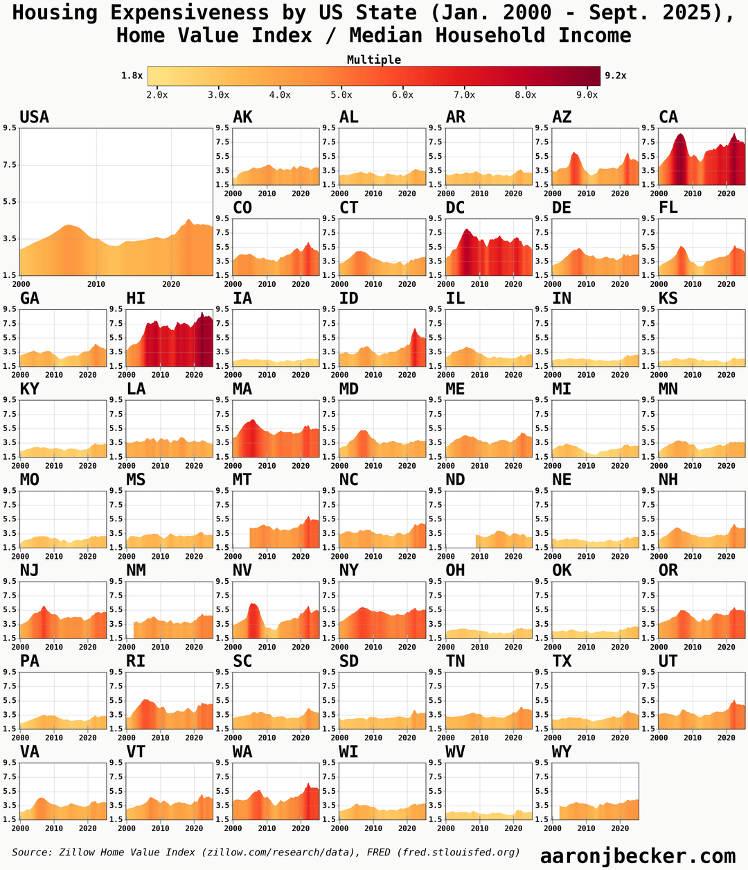
State-level median home value (Zillow Home Value Index) divided by state-level median household income, expressed as a multiple. Current housing affordability measured this way looks a lot like the period right before the Great Recession.
Code walkthrough with tables and analysis: https://aaronjbecker.com/posts/housing-expensiveness-by-state-2000-2025/
by aar0nbecker
3 Comments
Data sources:
* [Zillow Home Value Index](https://www.zillow.com/research/data/)
* [FRED Median Household Income by State](https://fred.stlouisfed.org/release/tables?eid=259462&rid=249)
Neither data series is inflation adjusted. I extrapolated the 2024 annual income forward using the long-term (25 year) trend to show the current year, when home values have pulled back. *The trends on the graph remain nearly the same even if you hold 2024 income constant.*
Tools: python, pandas, polars, matplotlib
[Code walkthrough with detail tables and analysis](https://aaronjbecker.com/posts/housing-expensiveness-by-state-2000-2025/)
I love this. I wonder if there’s a way to make the middle states more interesting to look at. I appreciate keeping it honest with same y axis throughout, but since color coding is already denoting expensiveness, better to index to 2000 prices for each and then all the lines will wiggle more and only the pricey coastal markets will go really red.
North Dakota was only invented in 2009