
I tracked how JIRA tickets moved across my development team to understand collaboration patterns and identify bottlenecks. This animated force-directed graph shows tickets clustering by assignee, with lines connecting blocking dependencies between team members.
Key insights emerged:
- Certain team members became critical bottlenecks as their work blocked multiple teammates
- One developer's bandwidth visibly "squeezed" over time as their average task criticality score increased
- Cross-team blocking relationships created unexpected workflow friction
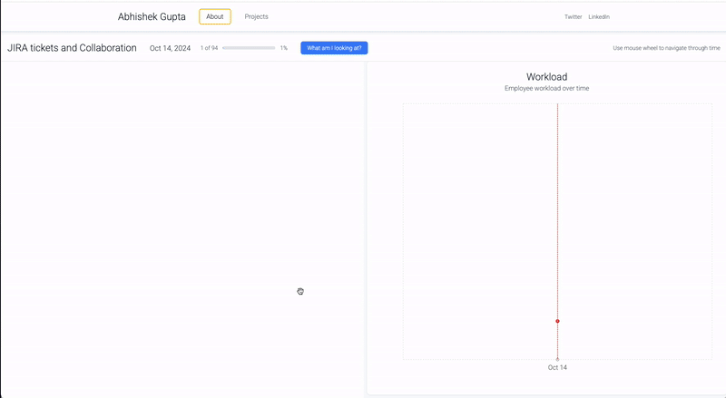
The visualization uses:
- Left panel: Force-directed physics simulation where tickets gravitate toward their assignee's focus point. Opacity indicates ticket age (older = more transparent). Red circles show blocking tickets, orange shows blocked tickets.
- Right panel: Timeline showing each team member's average task criticality score throughout the period. I came up with an arbitrary quantification for the ticket priority so that I could build a line graph.
You can scroll through time to see how the team's workload and dependencies evolved day by day.
Data source: Internal JIRA API export (anonymized)
Tools: D3.js for force simulation and canvas rendering, React for UI components, Recharts for timeline visualization . I did really heavily on prompt engineering to build this. I couldn't have done this without chatgpt and lovable. I did wrangle the data using Python to get it into a consumable format.
source: https://abzgupta.com/project_demos/jira_visualization.html
by espress0_addict