
From my blog, see full analysis here: https://polimetrics.substack.com/p/the-politics-and-demographics-behind
Data from NYTimes. Graphic made with Datawrapper. Graphic is interactive in original post if you’re interested.
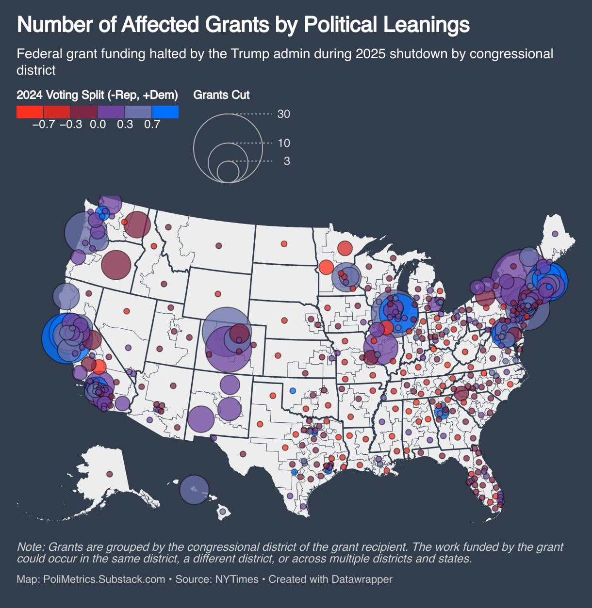
I analyzed the voting margins and demographics behind Trump’s October 2025 grant cuts.
The NYTimes reported that 87 Democratic districts had grants frozen vs. just 14 Republican ones. But they only showed party affiliation, not the actual vote margins or demographics of affected communities.
So I dug into the data. The surprising finds:
- Districts that got cut averaged +0.26 Democratic margin.
- Non-affected districts averaged -0.10 Republican. (p < 0.001)
The cuts didn’t hit poor communities. They hit wealthy ones.
- Cut districts: $95k median income
- Non-affected districts: $78k median income
And the demographic selectivity was interesting:
- Cut districts had 2x the Asian American population (10.3% vs 4.5%)
- Cut districts had fewer Black residents (9.6% vs 13.2%)
Think SF, Seattle, NYC suburbs – not Detroit, Baltimore, or majority-Black Southern cities.
Let me know what you think!
by Public_Finance_Guy
3 Comments
Do you have a source where cities and counties can search to see what grants specifically? Thank you for the broad analysis. The most effective way people can use the status to see how it affects them specifically and in particular.
All I see is that wealthy red states are relatively left alone (Texas, Florida, etc.) while blue states bear a disproportionate burden of cuts.
This is the kind of data that should end political careers.
There seems to be a theme here. Can’t quite put my finger on it.