
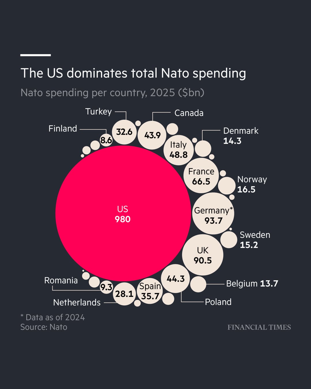
Donald Trump is pressing other alliance members to pay more for their own defence, arguing the US is 'paying for close to 100% of Nato'.
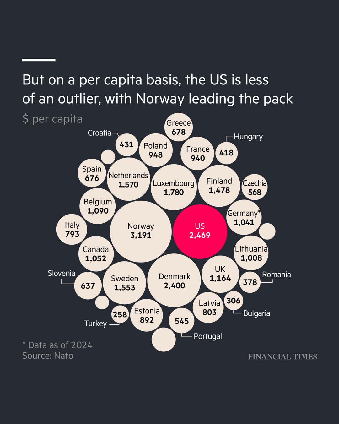
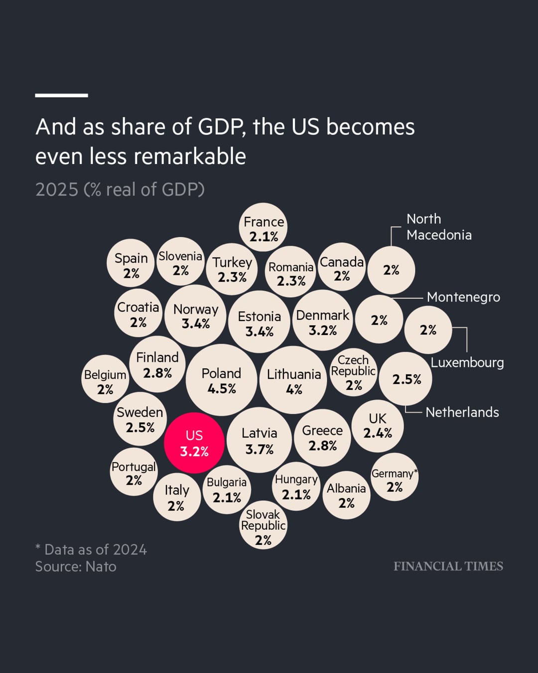
While America’s military budget dwarfs others in Nato, Trump’s assertion is not true. Some alliance members, especially Nordic and east European countries bordering Russia, are now paying more relative to their size than the US, or will be soon.
Source: Nato
Full story for context is here: https://www.ft.com/content/aa4d5bad-235c-4c94-b73e-dfe4e53241d4?segmentid=c50c86e4-586b-23ea-1ac1-7601c9c2476f
by financialtimes
10 Comments
I would also be interested in a breakout of which country is the money going.
The US is pretty good as a percentage of GDP.
The only countries that beat it as a share of GDP are the small states that are right on the Russian border that have very small GDPs and are right on the Frontline.
US GDP is enormous though. It’s a quarter of the world economy, the whole of the EU put together is only a sixth.
Judging by share of GDP, maybe it’s time for US to finally put in their fair share instead of leeching on us for defense? Maybe they can do their 5% first before trying to extort us, just so we can keep their military complex on life support?
With 3-3.5% we will have good enough equipment for any possible invasion in 2-3 years anyway (not like we can magically pop up new military factories overnight anyway) and then we just need to make sure that we don’t loose that capability in coming decades like we did in 00’s and 10’s
The total budget for nato is $4.6bn of which the US contributes 16%.
This chart does not show nato budget but total defence spending for each country.
Here is a chart for NATO spending as a share of GDP:
[https://i.abcnewsfe.com/a/8b366e9a-5353-4a83-9510-bad111a54d10/NATO_Members_2023_Defense_Spending_v05_dnl_1707950181328_hpEmbed_13x16.jpg?w=750](https://i.abcnewsfe.com/a/8b366e9a-5353-4a83-9510-bad111a54d10/NATO_Members_2023_Defense_Spending_v05_dnl_1707950181328_hpEmbed_13x16.jpg?w=750)
This is a stupid chart
Nato is not a “paid for” service like Netflix or some stupid shit, this is literally just a defense budget chart of how much countries spend on military defense.
The US did NOT give 980B dollars to nato, they spent it on their own BS
Also keep in mind the only time Nato has ever invoked article 5 was on behalf of the US after 9/11
Third chart is deceptive.
I’m not saying the numbers are wrong. But I am saying that the take away is misleading.
Percents are easy to misinterpret. If you are 2% or something and I am at 3%, we could say – well, small difference. But I’m at a number that is 50% larger than you. The chart makes it look like Canada and the US are in a similar percentage level. But there is a huge gap between Canada at 2% and the US at 3.2%. The US is spending 60% more as a share of its GDP. That is not a small difference.
A better representation would be to baseline the average % spend and then show everyone’s % spend relative to that baseline. Or just stop after charts 1 and 2. More information is not better when it twists the story.
The article quotes:
“The US spends the equivalent of about 3.5 per cent of its GDP on its military. But America’s commitment to Nato is considerably less than its overall defence spending, given its military deployments around the world, from the Middle East to the South China Sea.”
Framing global deployments as a deduction from it’s NATO efforts seems wild to me. A global logistics chain and freedom of navigation would directly help Europe in case of a Russian conflict, it’s naïve to think such a conflict would stay localised to Europe alone.
Those global deployments are easily redeployable towards Europe, large scale operations as exercised regularly.
Fun reminder on how data is presented can skew the interpretation. Reminds me of that lies and statistics idea. Also, how as someone else said, another chart could be what countries benefit most from the spend.