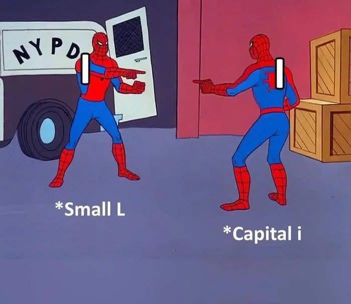
Fonts really said “let’s confuse everyone equally.”
generalantheia on
I l 🙂↕️
SpacemaN_literature on
Good WIll hunting
Goblin_Deez_ on
I knew a guy who actually could. Last I saw he was being taken away in a Black SUV by men in suits wearing sun glasses. That was 12 years ago.
SexRapistOfficial on
İ
Short-Knowledge-3393 on
Still a lot of people think that finnish folk song covered by Miku is called Levan polkka (it’s ievan actually)
zeus1911 on
Al
Darth-mickyluv on
Sans serif.
7turtlesinacoat on
Il
TheThinkerers on
IOI
ReporterIcy7986 on
This should be Illegal
NoWingedHussarsToday on
You can call me Al.
MRFANTA-STICK on
|
NerdyPlaneResident on
l can
yadavhemant27 on
1 in Roman Numeral
Personal_Ad7338 on
i haven’t seen any font differentiating them
ShroomsHealYourSoul on
Don’t forget number one too
lll
FairyGlowzzz on

Please help me
SentientFotoGeek on
Is it AI or some dipshit named Al? We may never know.
SonicBoom500 on
I think that one is **slightly** taller than the other, just a tiny bit 😅
Schrodingers_Gun on
You know, in battlefield1 there were cheaters using name like this so they don’t get reported to BFEAC(because it’s hard for reporters to type their names)
Snubben93 on
“I hate AI so much!”
Some guy named Al:

Natural_Anybody_7622 on
Lowercase letters that are as tall as capital letters are actually a bit taller
So capitalize are shorter
Local_Attitude9089 on
I have a suggestion why cant we add a little inclined line at the top of l (nvm its l not I)
KoishiKomeiji28 on
Its confusing sometimes.
Thordak35 on
ShaIl l calI your bIuff ?
PatrickSheperd on
I L
i l
FurbyMations on
IT’S CALLED LOWERCASE! NOT SMALL! LOWERCASE!
rygku on
I firmly believe this is due to marketers using “sans serif” fonts and somehow getting the rest of the world to believe that these “clean,” variable-width fonts are somehow “classier” or “more luxurious” than serif, fixed-width fonts.
If you check out Ubuntu Mono, Courier New, or even the variable-width Times New Roman, the “i” and “l” are much more easily distinguished.
I have this exact same rant about 0 (zero) and O (capital o) on shitty fonts. Heck, variable-width sans serif fonts can even make 1 (one), I (capital i), and l (lowercase L) difficult to tell apart.
Who knew that the Serifs were created on fonts to solve this exact problem?
AgreeableAnteater215 on
the i is slightly shorter i think
duckyTheFirst on
Actually my phones font makes the capital i just slightly (like 1 or 2 pixels) smaller than the lowercase l. Which is impossible to tell unless theyre next to each other. So idk why they even bothered
PixelPancakePrincess on
Literally every password I’ve ever had to type in a panic.
PoppyTease5 on
Sometimes, the smallest differences can cause the biggest confusion and this is definitely a case of who’s who
Speedygamer0303 on
I know that a capital “i” is a slight bit shorter than a lower case “L”
crazy-trans-science on
Is this AI
Collistoralo on
Would be fucked if you swapped them around so it said a capital i is l.
Equivalent_Bank_5845 on
Al vs AI
LucrenCrum25 on
Capital i is shorter than lowercase L (yes, I typed them as the opposite so you know which I’m talking about)
Delicious-Account103 on
Maybe you should use Turkish alphabet for capital i –> İ

39 Comments
Fonts really said “let’s confuse everyone equally.”
I l 🙂↕️
Good WIll hunting
I knew a guy who actually could. Last I saw he was being taken away in a Black SUV by men in suits wearing sun glasses. That was 12 years ago.
İ
Still a lot of people think that finnish folk song covered by Miku is called Levan polkka (it’s ievan actually)
Al
Sans serif.
Il
IOI
This should be Illegal
You can call me Al.
|
l can
1 in Roman Numeral
i haven’t seen any font differentiating them
Don’t forget number one too
lll

Please help me
Is it AI or some dipshit named Al? We may never know.
I think that one is **slightly** taller than the other, just a tiny bit 😅
You know, in battlefield1 there were cheaters using name like this so they don’t get reported to BFEAC(because it’s hard for reporters to type their names)
“I hate AI so much!”
Some guy named Al:

Lowercase letters that are as tall as capital letters are actually a bit taller
So capitalize are shorter
I have a suggestion why cant we add a little inclined line at the top of l (nvm its l not I)
Its confusing sometimes.
ShaIl l calI your bIuff ?
I L
i l
IT’S CALLED LOWERCASE! NOT SMALL! LOWERCASE!
I firmly believe this is due to marketers using “sans serif” fonts and somehow getting the rest of the world to believe that these “clean,” variable-width fonts are somehow “classier” or “more luxurious” than serif, fixed-width fonts.
If you check out Ubuntu Mono, Courier New, or even the variable-width Times New Roman, the “i” and “l” are much more easily distinguished.
I have this exact same rant about 0 (zero) and O (capital o) on shitty fonts. Heck, variable-width sans serif fonts can even make 1 (one), I (capital i), and l (lowercase L) difficult to tell apart.
Who knew that the Serifs were created on fonts to solve this exact problem?
the i is slightly shorter i think
Actually my phones font makes the capital i just slightly (like 1 or 2 pixels) smaller than the lowercase l. Which is impossible to tell unless theyre next to each other. So idk why they even bothered
Literally every password I’ve ever had to type in a panic.
Sometimes, the smallest differences can cause the biggest confusion and this is definitely a case of who’s who
I know that a capital “i” is a slight bit shorter than a lower case “L”
Is this AI
Would be fucked if you swapped them around so it said a capital i is l.
Al vs AI
Capital i is shorter than lowercase L (yes, I typed them as the opposite so you know which I’m talking about)
Maybe you should use Turkish alphabet for capital i –> İ