
Graphic by me, created in Excel using Census Bureau data here: https://www.census.gov/data/tables/time-series/demo/popest/2020s-total-metro-and-micro-statistical-areas.html
I created this graphic to highlight the stark difference in population trends between these two states, using the most recent two years of data.
What do you think is responsible for these differences? Will these trends continue?
by TA-MajestyPalm
2 Comments
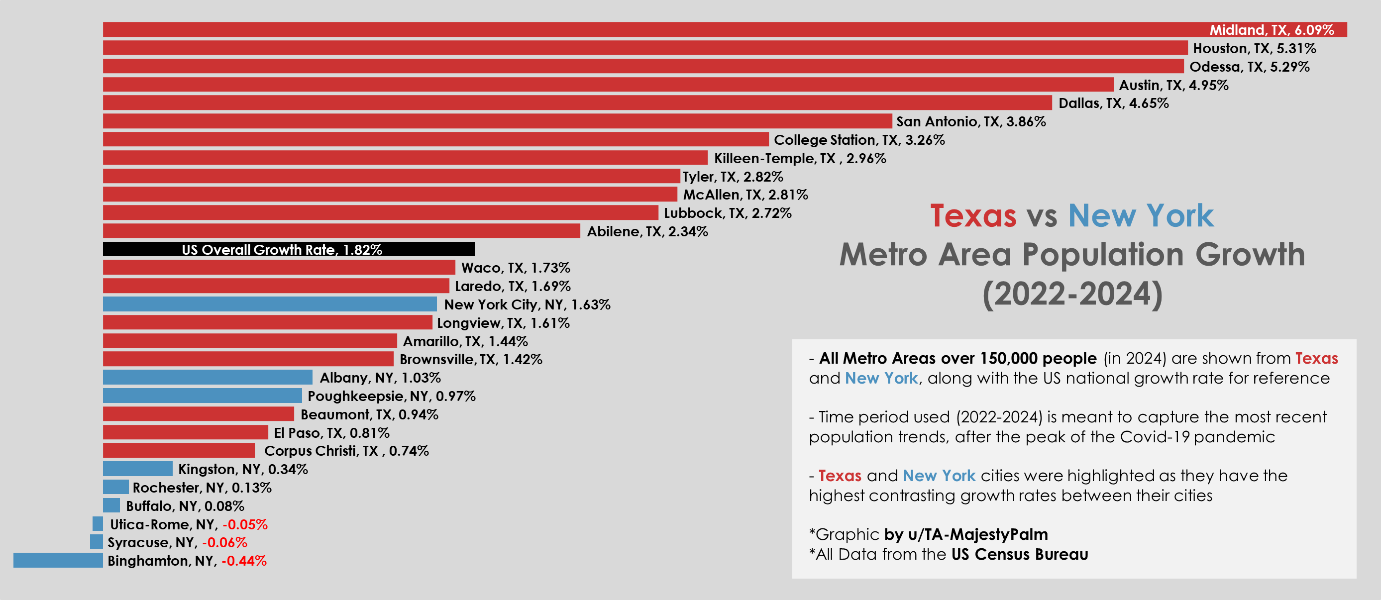
Graphic by me, created in Excel using Census Bureau data here: https://www.census.gov/data/tables/time-series/demo/popest/2020s-total-metro-and-micro-statistical-areas.html
I created this graphic to highlight the stark difference in population trends between these two states, using the most recent two years of data. I included the overall population growth of the entire US for reference.
What do you think is responsible for these differences? Will these trends continue?
Buffalo and Albany aren’t really part of the new york metropolitan area. The official area includes many counties in new jersey, which have grown in recent years.