
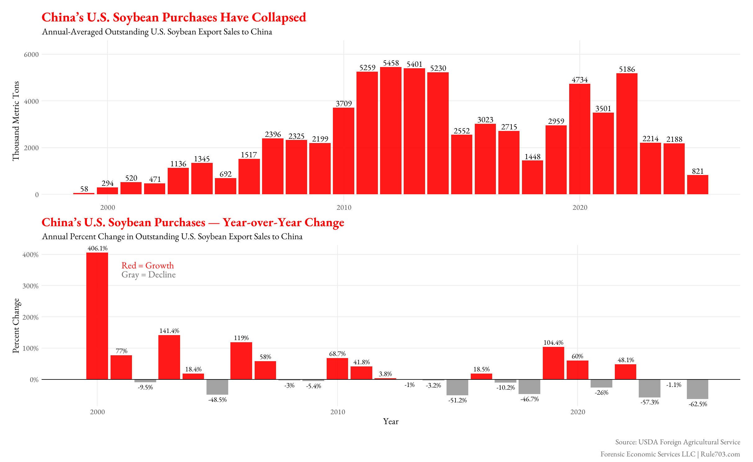
We used data from Source: USDA Foreign Agricultural Service (Export Sales Reporting) and used GGplot2 in R to show that after Beijing imposed retaliatory tariffs, U.S. soybean exports to China plunged to multi-decade lows. Even a brief rebound in 2021–2022 wasn’t enough to recover.
by forensiceconomics
4 Comments
Why are we assuming this isn’t just another one of those – years next to the other + years? Seems like we’re still following the same typical cycle without enough data to show a trend break.
Some suggestions: first, I think it might be worth labeling more years on the first graph; at least every 5, and definitely the current year. Second, I’m not a big fan of the second chart. Because of how percentages work, it ends up being highly misleading; if a good had a 1000% increase followed by three 70% decreases, you’d end up at around 30% of the original value, but the scale of the chart would be blown out by the 1000%. Which is sort of what’s happening here: the 60% decreases look insignificant because of the big spike at the start. I think it might work better with the second graph showing the difference in raw tons from year to year.
https://preview.redd.it/xl819k5n9ktf1.png?width=1920&format=png&auto=webp&s=05716edb8ff3f3d9590617ffaac3968fe7c54ffa
Brazil — and to a lesser extent, Argentina — have steadily captured market share**.**
“Art of the Deal”. 😂 For Venezuela!