
Hi everyone!
I’m a product designer working on an analytics dashboard for a management system, and I’d love to get your thoughts on how to best visualize data for non-technical users.
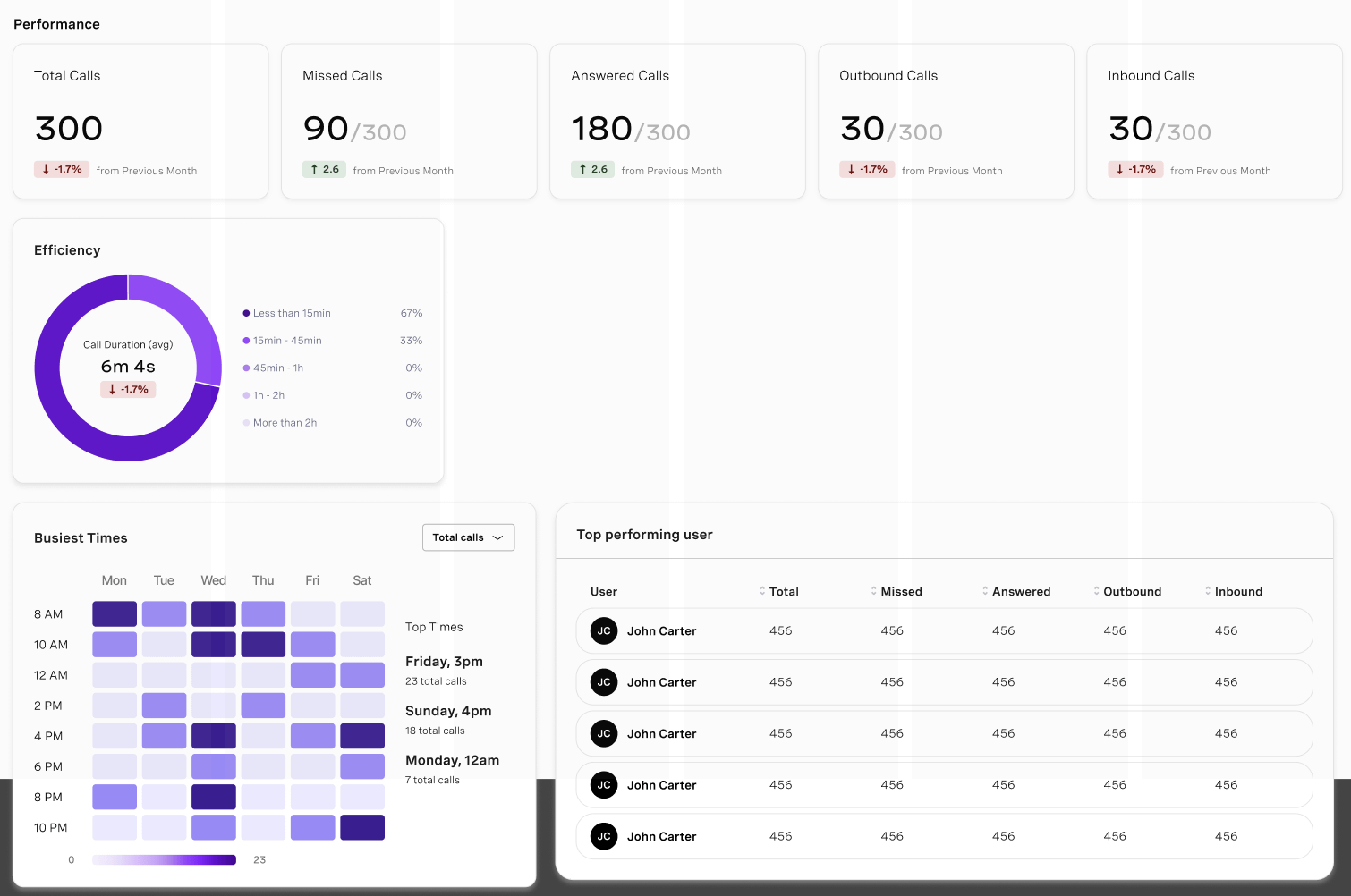
I added a quick preview of what I’ve been working on so far.
I’m not sure if this is the best way to visualize it since I’ve never designed data dashboards before, so I’d really appreciate any feedback or examples that could help me improve.
The goal of the dashboard is to provide quick, meaningful insights about business performance. For example:
- Day with most total / missed / answered / inbound / outbound calls
- User with most outbound / missed / answered / inbound calls
- Day + hour with most total / missed / answered / inbound / outbound calls
- Average daily total / missed / answered / inbound / outbound calls (last week vs. last month)
I want to make the information easy to grasp at a glance, while still giving users a sense of trends and context.
I’d love to hear your thoughts on:
- Which types of graphs work best for this kind of dataset (bar, line, heatmap, etc.)
- Any tips for communicating trends clearly to users who aren’t data-savvy.
Thanks in advance — any advice or examples would be super helpful!
by Ok_Muscle_6516
2 Comments
Where or how you got the data – its not a real data.
The tool used to generate the visual – figma
In my experience you basically have to ask each customer what questions that need to be able to answer.