
Hi all,
This is a supplementary chart from a larger interactive data story I created for a school project on Sri Lanka's Drug Crisis.
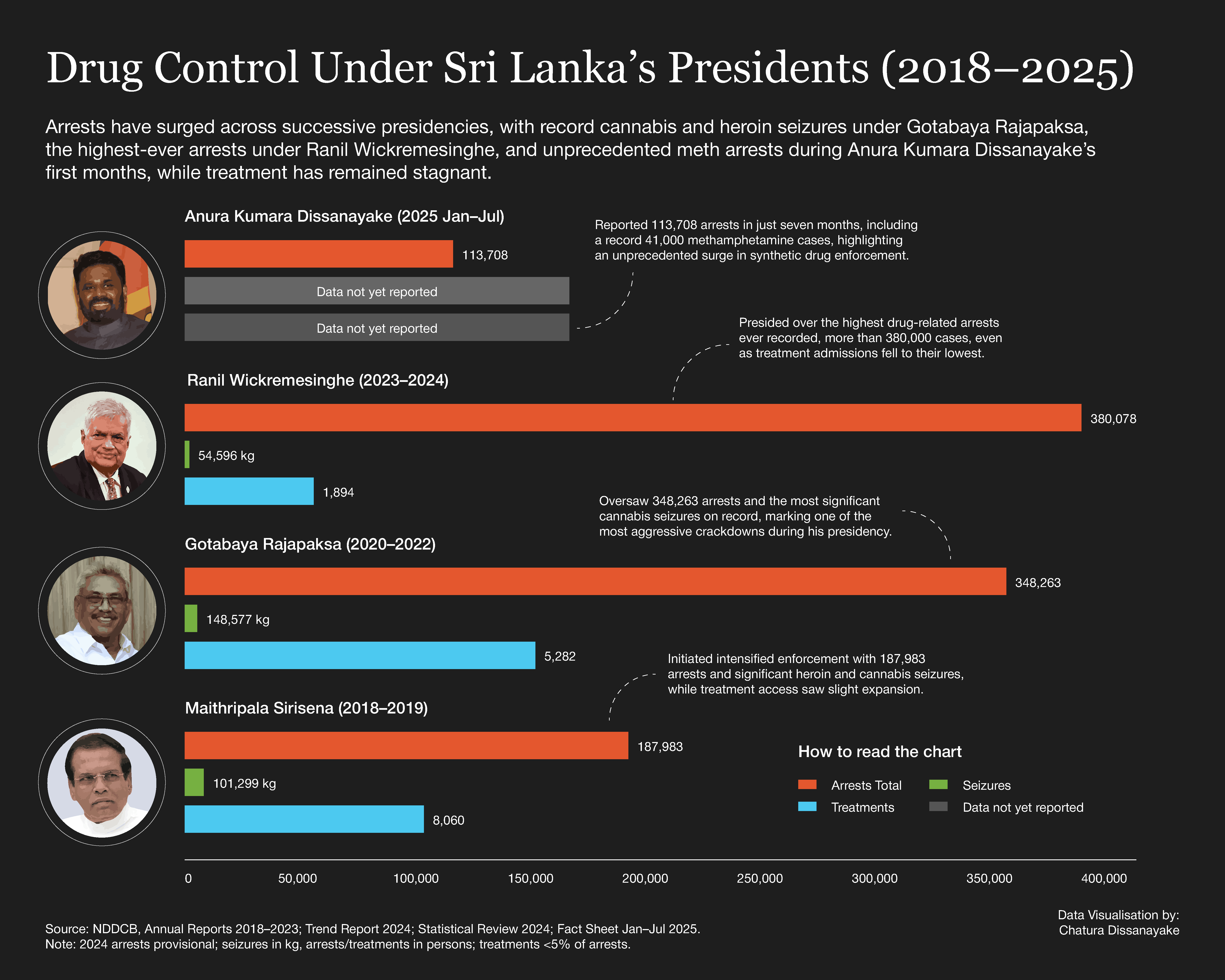
This visualisation breaks down the annual drug arrests across the last three presidential terms (from the end of Sirisena's term through Wickremesinghe's administration). The data clearly shows a massive surge in enforcement, particularly with the transition of power in 2022.
This chart is now integrated into my main project, which analyses the full context of arrests, seizures, and the lack of corresponding public health treatment infrastructure.
You can view the full interactive story and explore the other findings here: 🔗 Full Interactive Story: https://chaturadissanayake.github.io/sri-lanka-drug-crisis-website/
Feedback on the chart's design or data presentation is welcome!
by MediaCorrect4470
3 Comments
Now that’s a correlation you can’t ignore. The data speaks for itself.
Hey good first pass!
1) Doesn’t make much sense to put different things with vastly different magnitudes on the same axis
2) Might illustrate your point better to standardise by time unit (eg arrests per month)
3) Grams seized is mixing data from multiple categories – 100g of weed is very different from 100g of coke – so it isn’t very informative
why is the 8k blue line shorter than the 5k blue line?