
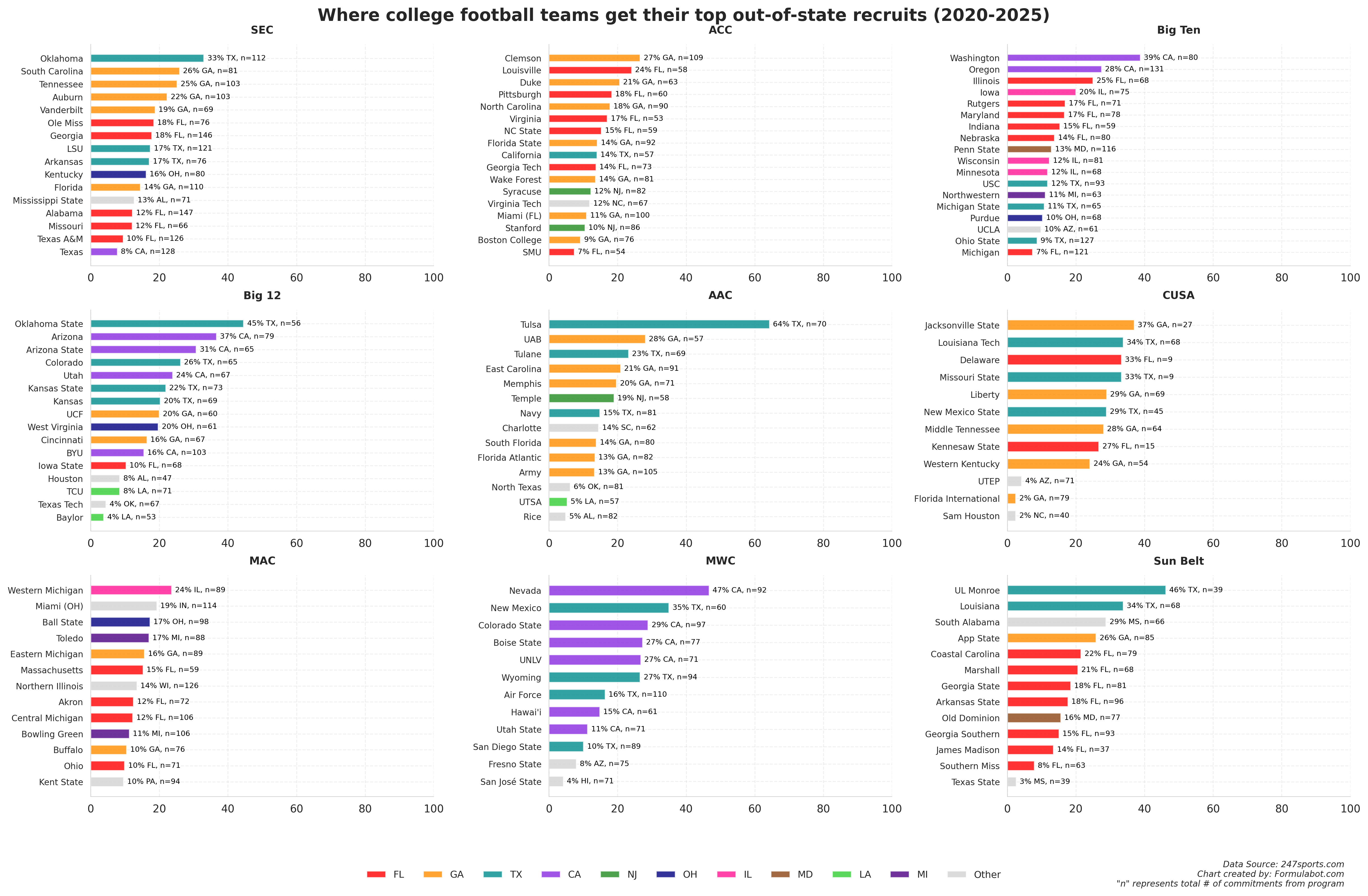
This chart shows each college football team's highest single out-of-state recruiting dependency from 2020-2025. Each bar represents the percentage and total number of recruits that came from one specific out-of-state source. For example, Tulsa's bar shows (64% TX, n=70), meaning 64% of their recruits (45 out of 70 total) came from Texas – their single largest out-of-state pipeline. The colors represent the top different states. Teams with grey bars recruit most heavily from states outside the top 10 sources.
Data source: 247sports.com (collegefootballdata.com API)
Database & Data Viz Tool: Formulabot.com/football-recruits
The database contains high school football recruiting data from 247sports.com, covering 61,000+ players with details on rankings, schools, commitments, positions, ratings, and geographic information from 2005 – 2025. It's been combined with NFL draft results to determine if the player was drafted.
Side note: The chart is filtered for P5 & G5, so it leaves off ND.
by No-Comfortable-9418
2 Comments
The chart colors are truly useless.
They are confusing, don’t particularly add any information, and the legend at the bottom is incomplete.
Also, the bar graph , from what I can tell, tells you the TOP state they recruit from not all the states they recruit from so the title is incorrect too.
The title is also incorrect because its not weighting for their “top” recruits (i.e. the highest rated) but the volume of recruits.
Navy and Air Force both have Texas as their top source. Since academy appointments are capped, I wonder if it is harder to get into those academies as a male Texan who doesn’t play football.