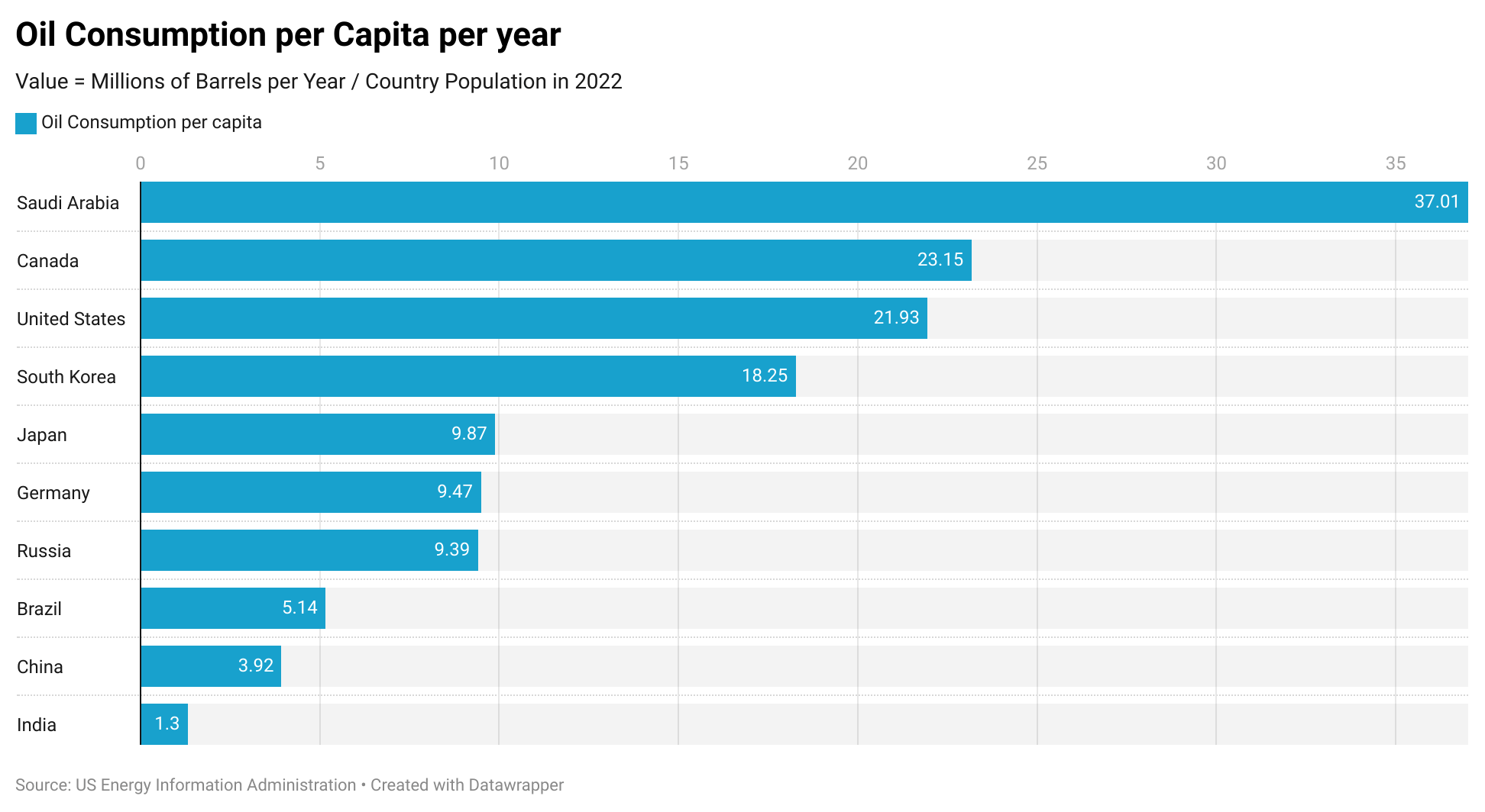
Prof_XdR on May 29, 2024 4:58 pm Basically, I wondered Abt this data posted here: https://www.reddit.com/r/dataisbeautiful/s/ZWuMPBoDOy So I grabbed the million barrel per day data, multiply by 365 to get yearly, then divide by population in million to get the numbers on the chart. Saudi has the highest oil consumption by population and India has the lowest
Ghost_of_Syd on May 29, 2024 5:09 pm The units are messed up in this chart. For example, based on the chart title, it looks like 37 million barrels of oil per person for the US.

3 Comments
Basically, I wondered Abt this data posted here:
https://www.reddit.com/r/dataisbeautiful/s/ZWuMPBoDOy
So I grabbed the million barrel per day data, multiply by 365 to get yearly, then divide by population in million to get the numbers on the chart.
Saudi has the highest oil consumption by population and India has the lowest
The units are messed up in this chart. For example, based on the chart title, it looks like 37 million barrels of oil per person for the US.
So basically, the places that *have* the oil are using the oil.