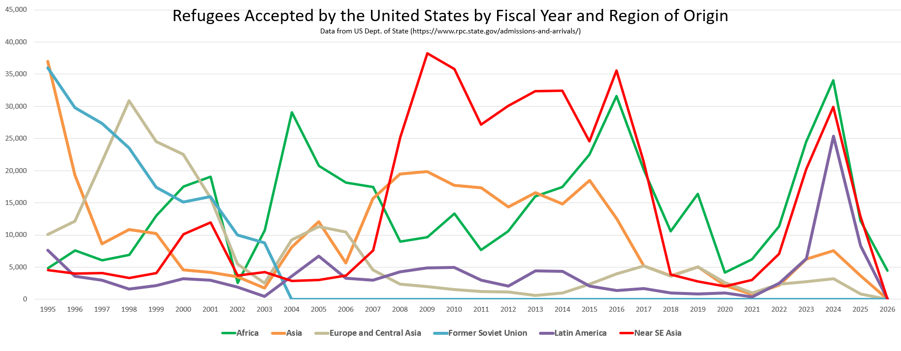
“Fiscal Year” starts in October of the previous year. So far for fiscal year 2026, there have been 4499 refugees admitted, 4496 from South Africa, 3 from Afghanistan. Since January 2025, there have only been 33 refugees accepted from all other countries other than South Africa and Afghanistan.
bartzman on
What is near se Asia? Like Myanmar or something?
Yarhj on
Showing the total would also be interesting, to more directly visualize differences in coarse immigration policy vs demographic-specific shifts.
Might also be worth breaking into several charts to clean things up and make it clearer, given that there are a few stories here. With everything visualized together it’s a bit of an eye chart, and it’s hard to immediately pull out interesting trends.
The Europe+USSR numbers clearly link to the story of the end of the Cold War and something going on in the mid 00s, but they’re not particularly interesting after 2010.
The Asia and Near SE Asia numbers seem to be broadly correlated, and could probably just be combined into a single category without losing much in the way of interesting information.
Flaky_History12 on
So depending on where I want these lines is who I vote for? /s

4 Comments
Made in Excel, based on data from the US Dept of State (https://www.rpc.state.gov/documents/Refugee%20Admissions%20Report%20as%20of%20March%2031,%202026.xlsx).
“Fiscal Year” starts in October of the previous year. So far for fiscal year 2026, there have been 4499 refugees admitted, 4496 from South Africa, 3 from Afghanistan. Since January 2025, there have only been 33 refugees accepted from all other countries other than South Africa and Afghanistan.
What is near se Asia? Like Myanmar or something?
Showing the total would also be interesting, to more directly visualize differences in coarse immigration policy vs demographic-specific shifts.
Might also be worth breaking into several charts to clean things up and make it clearer, given that there are a few stories here. With everything visualized together it’s a bit of an eye chart, and it’s hard to immediately pull out interesting trends.
The Europe+USSR numbers clearly link to the story of the end of the Cold War and something going on in the mid 00s, but they’re not particularly interesting after 2010.
The Asia and Near SE Asia numbers seem to be broadly correlated, and could probably just be combined into a single category without losing much in the way of interesting information.
So depending on where I want these lines is who I vote for? /s