
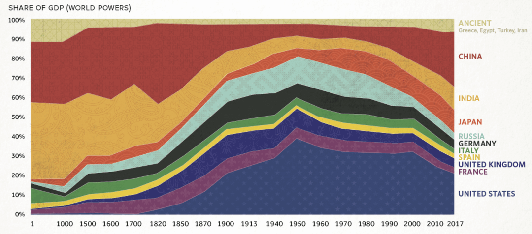
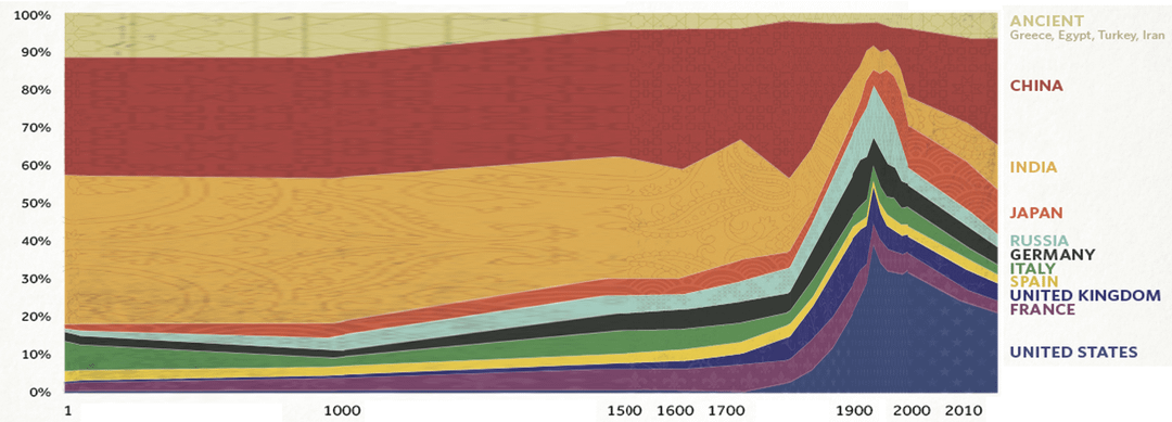
Annoyed by this chart's nonsense x-axis… I get that it looks prettier and that we don't have a lot of hard data on economies between 1 and 1500… but still couldn't resist the urge to do a quick re-stretch of their data to a consistent scale… https://www.visualcapitalist.com/2000-years-economic-history-one-chart/
by DestructiveSeaOtter
13 Comments
What is that inflection point in the late 1940s? End of WWII?
Props to Spain, France and Italy for keeping it pretty stable for the whole history. And to the guy who calculated GDP of Spain in 1 a.d. somehow.
It’s too bad GDP is unreliable before the first half of the 20th century and complete garbage before the Industrial Revolution
Really well done! When I first saw this graph I had the same urge lol although mine was a lot less pretty because I just stretched different sections of the chart lol
It looks pretty but any pre-1900 GDP data is shot in the dark guesses.
i learnt at school UK had 25% of global gdp at peak, and london was busiest port in the world, is this not true
OMG I love this fix! The original spacing was driving me nuts lol, this makes so much more sense visually.
How exactly did Spain not increase in GDP when they had the largest colonial empire?
What the heck is Russia before 1000? Did I miss something in history lessons?
the whole graph is unreliable, shows china as the same contribution to global gdp in 2017 as US + france + UK when it had just over half of the combined gdp of the 3 (china had ~12.88 trillion USD gdp in 2017, US france and uk combined had 24.88 trillion (US alone had 19.68 trillion))
Great fix, and I love that it highlights how central India and China were to history.
But it also raises so many questions
– Where are the Islamic empires? Mongol Empire?
– Italy, Spain, and France didn’t exist in 1 AD.. Or 1000 AD.. so what do those lines mean?
– Iran, Turkey etc are lumped together as ancient civilizations … but they still exist??
So now I don’t know what I’m looking at
How does that work
Like (almost) all of these countries only got their recent border within the last 100 years. Heck, most of them didnt even exist.
Great Britain came out of nowhere at the start of 19th century to quickly become a big power, and interesting how at the same time India declined.
Great chart though. But I do wish we also had Netherlands and Portugal which were big powers around 16th 17th centuries. Also Turkey should’ve been its own category given the Ottoman power around 15th century. The chart gives too much weight in the past 300 years even though it begins all the way at year 1.