
Data: World Inequality Database via {wid}
Tool: R
🔗 #rstats code: https://github.com/ikashnitsky/30daychart2026
🧙♂️ pplx chat: https://www.perplexity.ai/search/day-9-wealth-let-s-explore-wor-OrnqM3hMTa2y1_VvXZDOYA
by ikashnitsky
Data: World Inequality Database via {wid}
Tool: R
🔗 #rstats code: https://github.com/ikashnitsky/30daychart2026
🧙♂️ pplx chat: https://www.perplexity.ai/search/day-9-wealth-let-s-explore-wor-OrnqM3hMTa2y1_VvXZDOYA
by ikashnitsky
3 Comments
This would look better with the percentage on the vertical and year on the horizontal axis. You could make the countries different colors and the whole thing would be much more intuitive.
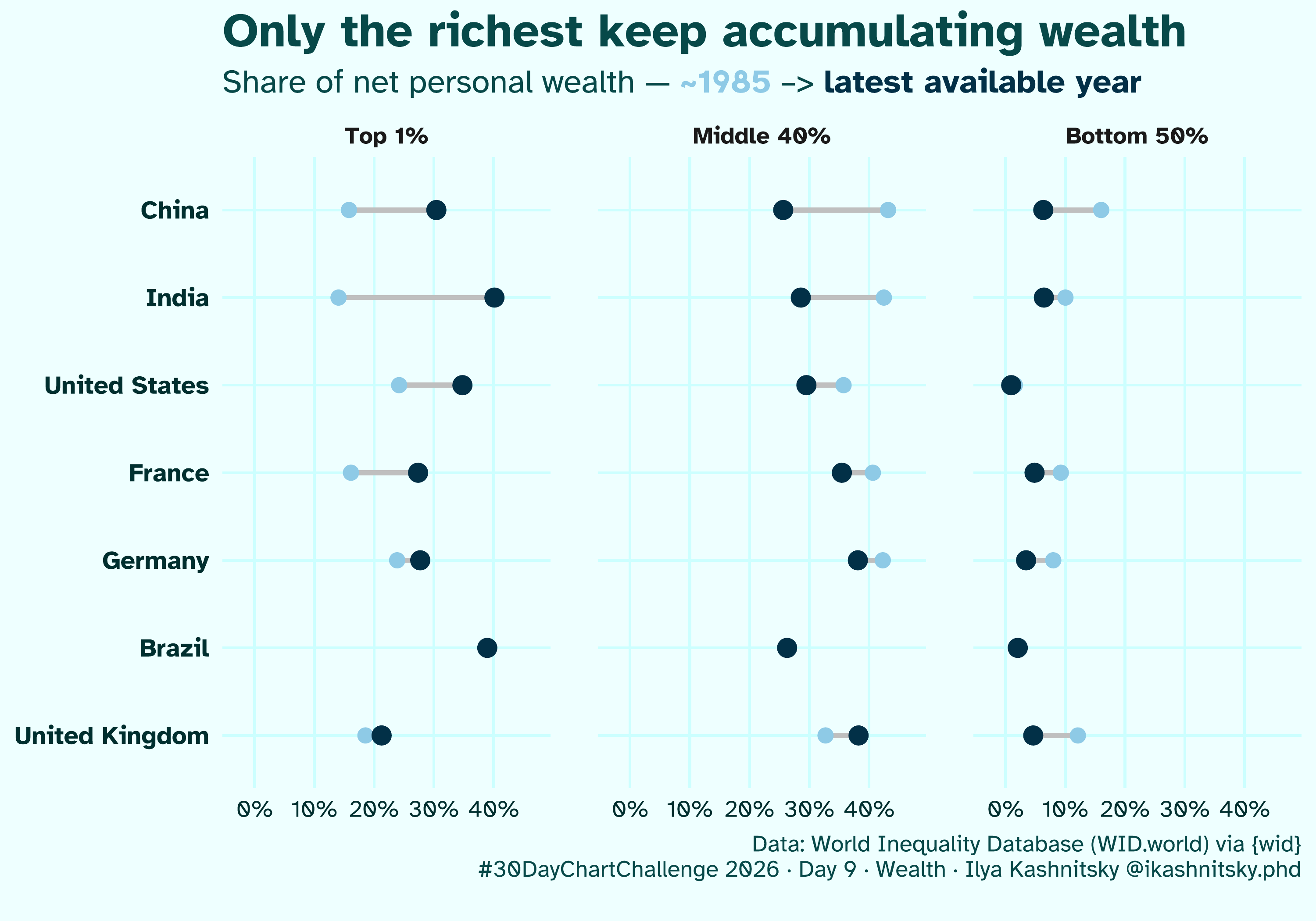
The rich got filthy rich. Everyone else got quite a bit richer.
Since 1985, the pie has grown tremendously. China is the clearest example of that. In 1985, the GDP there was about 310B. Today, in 2026, it’s around 20000B. That’s a 65x increase. Going with rough numbers from the graph, the middle class was sharing 139B. Today, they share 5000B. That’s a 36x increase. Adjust for a 40% population increase, and you still get about 25x.
Of course, in other places the difference is less dramatic. In my opinion, you still need to be a nutcase to preach against the rich getting filthy rich as a side effect.
The title on the chart doesn’t match the data. This is share of wealth, not absolute wealth.
If in 1985 we all shared $100 say, the 1% have $30, middle $40, bottom $30.
If now we all share $300 and say the top have $150, the middle have 90, the bottom have $60.
They are all more wealthy, they have all accumulated wealth, just the increase is uneaven. You would rather be poor now rather than then.