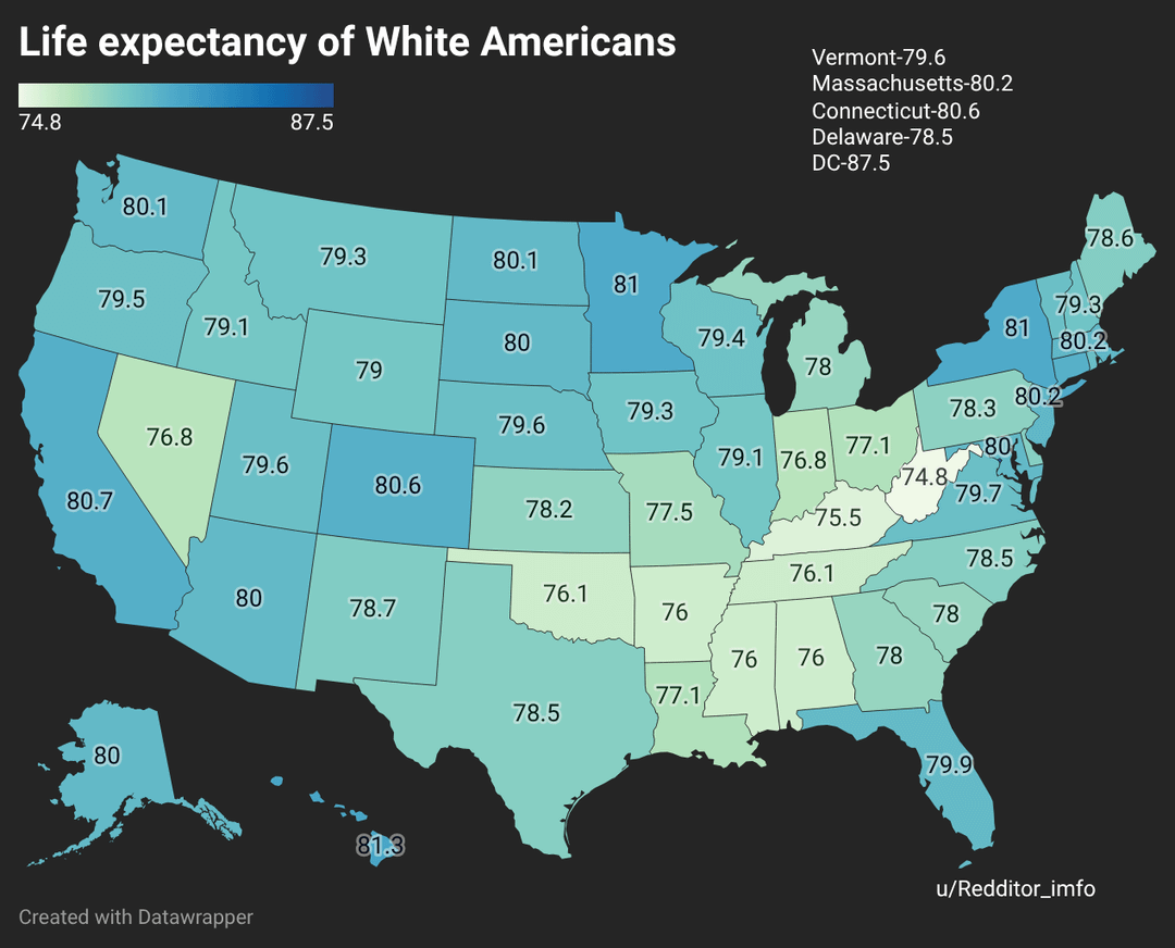
Why would you not use the same color scale for each one…
leonprimrose on
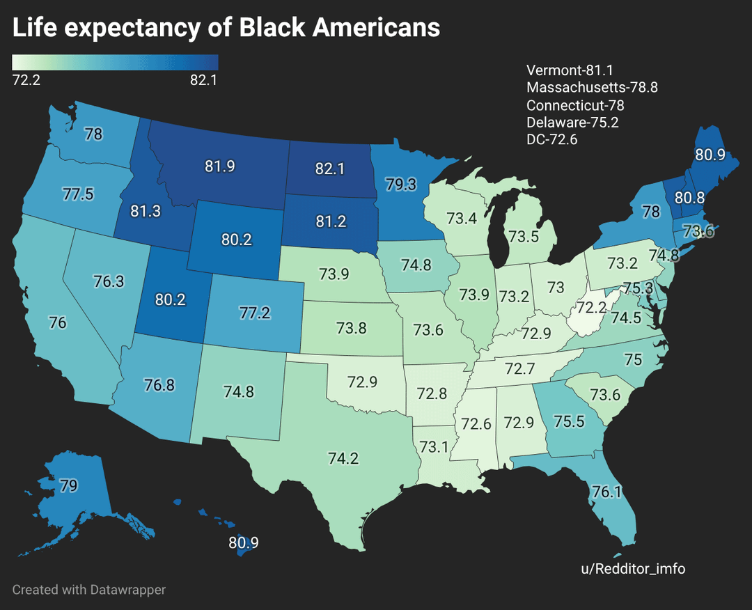
I feel like the color scale should be weighted the same for each because the way it’s set up looks like white americans live shorter lives than black americans but the numbers show that’s not the case
magonba on
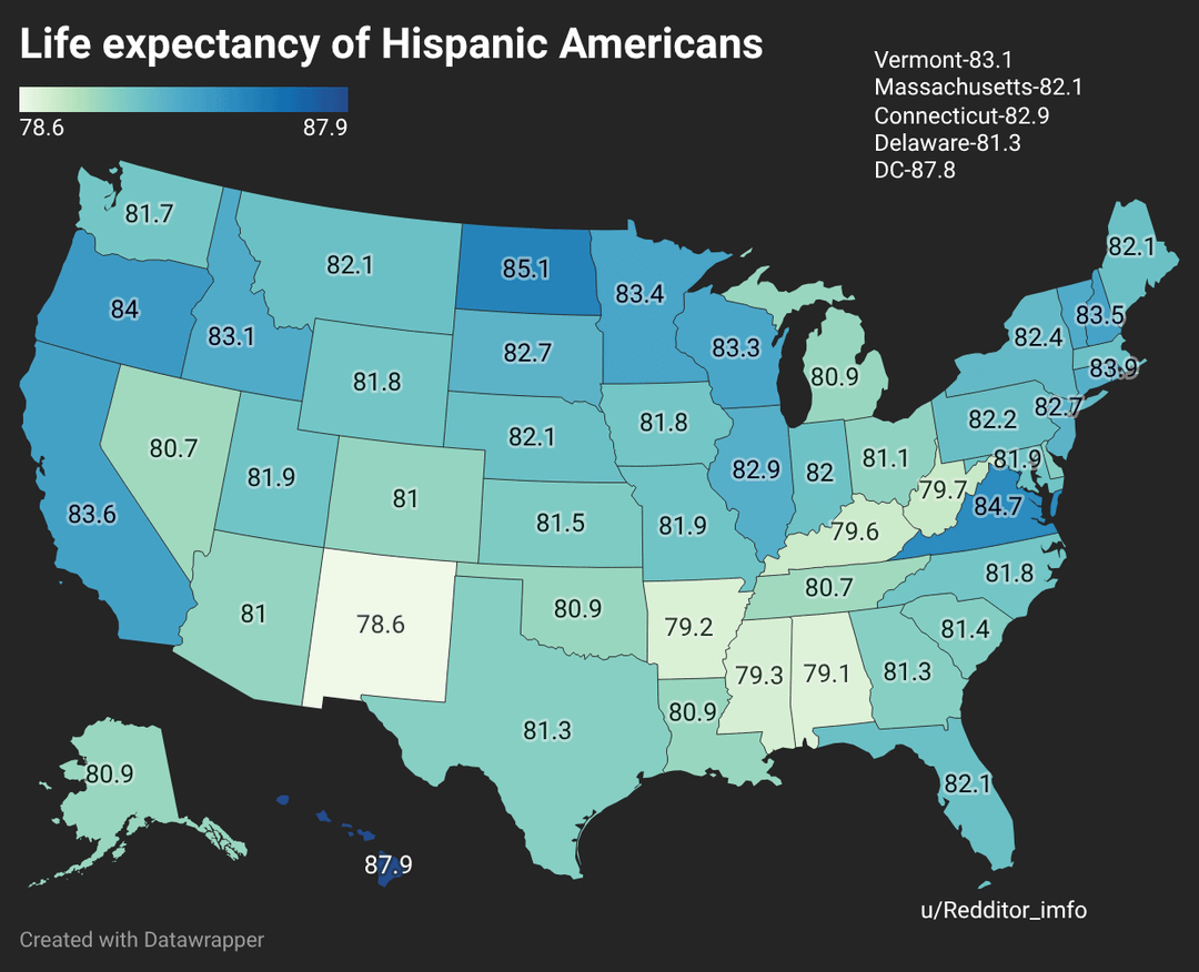
Hispanics live longer than white people although they are on average much poorer? That is very interesting.
Whatever801 on
As if I needed more excuses to eat tacos
No-Grapefruit-5464 on
Leave the U.S. if you’re black. Is that the message? There needs to be an intelligence over time in relation to this chart.
swindlemachine on
Hispanics stay winning
jk look at all the ice stuff going on…
at least we got this..!
mikerichh on
Not keeping the age range the same makes this data visualization really confusing or misleading
Woodit on
Like most of these sorts of questions it’s seems to follow average incomes broke out by state mostly
vanilla_w_ahintofcum on
Why not a bar chart showing all three ethnicities by state? Flipping back and forth between the maps sucks.
Kiroto50 on
Why not use RGB values for colors for each race and display everything on a single map?
Itsnotsponge on
I love how every map of the US lines up with the electoral college exactly how youd expect
onthenerdyside on
DC’s white population figures are skewed by the Senate and the White House
breakthro444 on
I see that OP knew everyone would be shook AF if they saw our Asian forever-genes.
But also, shout-out to my fellow Massholes for taking care of our people.
Massive_Basket_172 on
The first slide explains why old white people refuse to stop running for office – DC at 87.5?!?
exileonmainst on
You’ve got the tool used to create it and your reddit name but not where the data comes from…
Gullible_Agent8403 on
Are these numbers including or excluding infant mortality? Curious to see the change if that is taken out or included.
gobbedy on
Have Asians hurt you in some way?
PM_ME_HOUSE_MUSIC_ on
All the old fossils in congress skewing the data in DC
MajesticTrainer9140 on
As we all know, Asians live forever
Themanstall on
Those 5K Black people in Montana are really bringing up the averages there.
kid_blue96 on
How much of this is due to Hispanics moving to another country near the end of old age? I have a lot of friends whose family did some version of that.
Bazzzookah on
70-something is still surprisingly high, considering all the health issues among so many Americans, and the lack of proper healthcare for the uninsured, the underinsured, the homeless, and the undocumented.
tigole on
Why do Black Americans live longer in Montana and surrounding states?
Rakebleed on
That one black guy in North Dakota.
Nathanwhowrites on
Go Hawaii. 1st in the first 2, top 5 in the other last category.
lakebistcho on
Why do these things routinely ignore Asians?
Yo_Mr_White_ on
As a hispanic man well versed with white american culture, my **guesses** as to why we live longer are:
* Most hispanics are mixed race people (native american mixed with southern european and some african)
* You’ve ever heard that pure bred dogs live shorter?
* Hispanics dont get stressed as much as we take life less seriously. Stress is rampant in white people over the most insignificant things.
* More likely to eat home cooked meals than to eat out. More traditional gender roles lead to more home-cooked meals from the wife. You dont have to agree with it being right or not. That’s not the point.
**Hispancs really punch above their weight class** despite having a similar economic situation to black people and having way less access to health care than whites or blacks due to lack of immigration documentation being common issue in our community.
sammorganIII on
Not that helpful of a chart without socio economic stats or more specific geo graphics. Zipcode says more than state
JTuck333 on
You forgot East Asians. Asian Americans outlive every other country.
LlamasunLlimited on
Non-American here (NZer) but have spent a reasonable amount of time in the western half of the USA over the years. Assuming these maps are accurate, there’s some interesting situations shown.
a) Why is Nevada significantly lower than the surrounding states? (almost the same as some Deep South states)
b) Black American LE seems to be “pretty good” in the upper midwest region (plus the far NE of the USA). What’s behind that? (given the traditional perspective of economic/political discrimination against blacks in particular)
It would be interesting to see a 4th map showing Native American LE rates by state.
It would also be interesting to see line graphs of changes in LE across these groups over the past 50 years.
TIA for any insights.
CMWalsh88 on
What is going on with Latinos in West Virginia?
martinode on
I understand why the color gradient changes for each group, but it would show more stark contrast in life expectancy immediately between the three maps if they were all using the same color gradient

32 Comments
Why would you not use the same color scale for each one…
I feel like the color scale should be weighted the same for each because the way it’s set up looks like white americans live shorter lives than black americans but the numbers show that’s not the case
Hispanics live longer than white people although they are on average much poorer? That is very interesting.
As if I needed more excuses to eat tacos
Leave the U.S. if you’re black. Is that the message? There needs to be an intelligence over time in relation to this chart.
Hispanics stay winning
jk look at all the ice stuff going on…
at least we got this..!
Not keeping the age range the same makes this data visualization really confusing or misleading
Like most of these sorts of questions it’s seems to follow average incomes broke out by state mostly
Why not a bar chart showing all three ethnicities by state? Flipping back and forth between the maps sucks.
Why not use RGB values for colors for each race and display everything on a single map?
I love how every map of the US lines up with the electoral college exactly how youd expect
DC’s white population figures are skewed by the Senate and the White House
I see that OP knew everyone would be shook AF if they saw our Asian forever-genes.
But also, shout-out to my fellow Massholes for taking care of our people.
The first slide explains why old white people refuse to stop running for office – DC at 87.5?!?
You’ve got the tool used to create it and your reddit name but not where the data comes from…
Are these numbers including or excluding infant mortality? Curious to see the change if that is taken out or included.
Have Asians hurt you in some way?
All the old fossils in congress skewing the data in DC
As we all know, Asians live forever
Those 5K Black people in Montana are really bringing up the averages there.
How much of this is due to Hispanics moving to another country near the end of old age? I have a lot of friends whose family did some version of that.
70-something is still surprisingly high, considering all the health issues among so many Americans, and the lack of proper healthcare for the uninsured, the underinsured, the homeless, and the undocumented.
Why do Black Americans live longer in Montana and surrounding states?
That one black guy in North Dakota.
Go Hawaii. 1st in the first 2, top 5 in the other last category.
Why do these things routinely ignore Asians?
As a hispanic man well versed with white american culture, my **guesses** as to why we live longer are:
* Most hispanics are mixed race people (native american mixed with southern european and some african)
* You’ve ever heard that pure bred dogs live shorter?
* Hispanics dont get stressed as much as we take life less seriously. Stress is rampant in white people over the most insignificant things.
* More likely to eat home cooked meals than to eat out. More traditional gender roles lead to more home-cooked meals from the wife. You dont have to agree with it being right or not. That’s not the point.
**Hispancs really punch above their weight class** despite having a similar economic situation to black people and having way less access to health care than whites or blacks due to lack of immigration documentation being common issue in our community.
Not that helpful of a chart without socio economic stats or more specific geo graphics. Zipcode says more than state
You forgot East Asians. Asian Americans outlive every other country.
Non-American here (NZer) but have spent a reasonable amount of time in the western half of the USA over the years. Assuming these maps are accurate, there’s some interesting situations shown.
a) Why is Nevada significantly lower than the surrounding states? (almost the same as some Deep South states)
b) Black American LE seems to be “pretty good” in the upper midwest region (plus the far NE of the USA). What’s behind that? (given the traditional perspective of economic/political discrimination against blacks in particular)
It would be interesting to see a 4th map showing Native American LE rates by state.
It would also be interesting to see line graphs of changes in LE across these groups over the past 50 years.
TIA for any insights.
What is going on with Latinos in West Virginia?
I understand why the color gradient changes for each group, but it would show more stark contrast in life expectancy immediately between the three maps if they were all using the same color gradient