
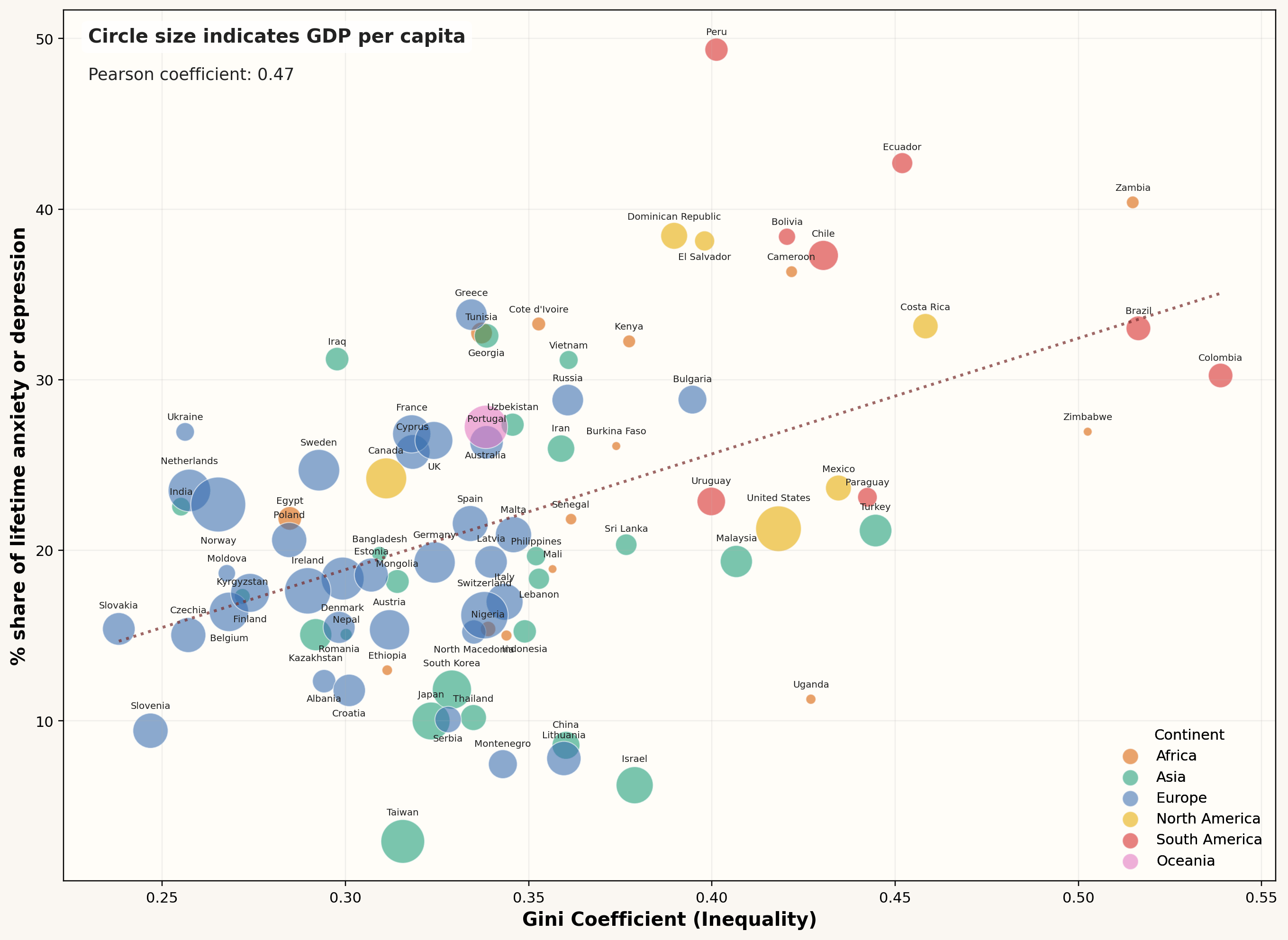
Data sources:
GDP per capita – Wellcome, The Gallup Organization Ltd. (2021). Wellcome Global Monitor, 2020. Processed by Our World in Data
https://ourworldindata.org/grapher/gdp-per-capita-maddison-project-database
Gini Coefficient – World Bank Poverty and Inequality Platform (2025) with major processing by Our World in Data
https://ourworldindata.org/grapher/economic-inequality-gini-index
% share of lifetime anxiety or depression – Bolt and van Zanden – Maddison Project Database 2023 with minor processing by Our World in Data
https://ourworldindata.org/grapher/share-who-report-lifetime-anxiety-or-depression
Data graphed using matplotlib with Python, code written with the help of codex.
by lasushin
19 Comments
Love how Taiwan is completely relaxed right now, must be cool under pressure lol.
Also what is happening in Peru?
Neat, however cultural bias likely aggressively skews depression rates. Reminds me of the “100 years ago, nobody had autism, was gay, etc…” stuff where the truth is that eg autism rates have likely been rather constant but so stigmatized that it went unreported/diagnosed. Taiwan, for example, has stong stigmas about mental health, so it’s very likely that anxiety rates are severely underreported.
The post title is missing the word “Inequality”.
The only graph where Serbia is between Japan and South Korea.
India has very low inequality?
So… there is no correlation?
The title is not at all the graph.
The graph is showing how **disparity** of income in a society correlates with anxiety.
Would love to see this adjusted for purchasing power parity
Gini is income *inequality* not income.
Which is a less surprising result than “greater income correlates with greater anxiety and depression”
How you see a correlation in this noise is beyond me
Peru have highest depression? I find that hard to believe.
Income inequality, not income. And it’s a moderate correlation only.
So first off, this is not correlating to income, but to income inequality.
Second, the fact that it correlates is misleading, as the Gini coefficient at best is a proxy for something else going on, e.g. economic outlook or whatever, at worst it is a spurious correlation.
Not everything that correlates is actually a valid correlation.
That’s not a particularly strong correlation. In fact if you were to control for the region, I doubt there would be one at all.
I find it incredible that 50% of people in Peru responded yes to ‘Have you ever been so anxious or
depressed that you could not continue your regular daily
activities as you normally would for two weeks or longer?’, that seems insane to me, I could be talking from a place of privilege but that’s a huge figure. I’d love to see the sample size and how the questionnaire was distributed.
Sorry, I meant to say Inequality, not income.
Israel and Taiwan least stressed? Nah this data is BS haha
Can someone explain this chart like I’m 5yrs old?
I wonder what the difference is in Greece and Macedonia