
Figured I would try reposting with the many formatting changes people suggested.
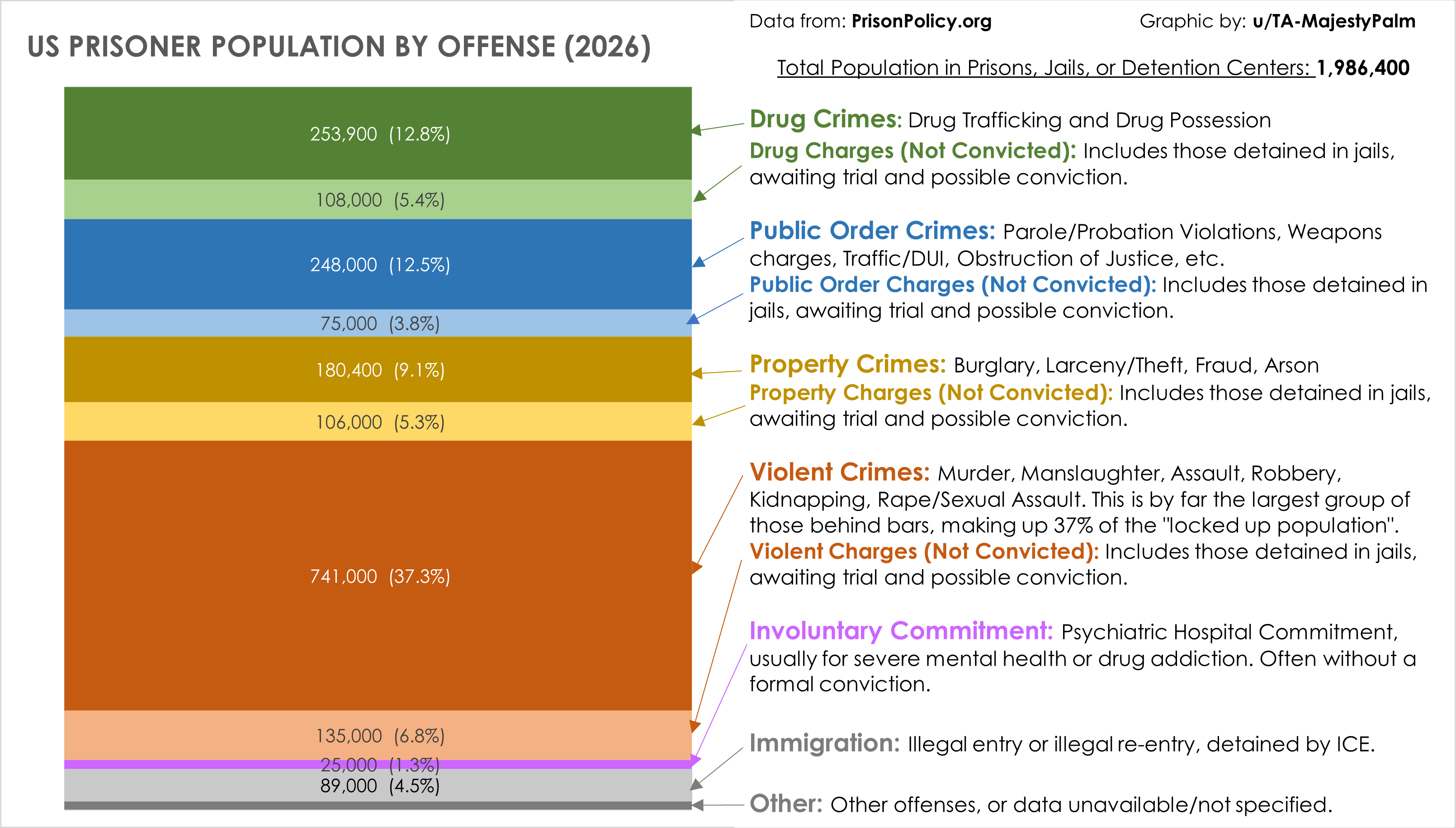
Graphic by me, created in Excel. This data includes everyone who is "locked up" currently in the US: National, State, and local prisons, jails, mental hospitals, youth detention centers, immigration offenders detained by ICE, military prison, etc.
Data source is here – they did all the hard work and have much more detailed graphics than mine. They pull from a number of different sources: https://www.prisonpolicy.org/reports/pie2026.html
by TA-MajestyPalm
5 Comments
I figured I would try reposting this with the many formatting changes people suggested this morning.
Graphic by me, created in Excel. This data includes everyone who is “locked up” currently in the US: National, State, and local prisons, jails, mental hospitals, youth detention centers, immigration offenders detained by ICE, military prison, etc.
Data source is here – they did all the hard work and have much more detailed graphics than mine. They pull from a number of different sources: https://www.prisonpolicy.org/reports/pie2026.html
Is there any reason for the ordering of the categories, and it not being largest to smallest?
I feel it would be good to see the order, instead of having to figure it out for yourself by looking at the percentages.
Jeez. A 5th of all prisoners aren’t even convicted?
The solution here is something the US public will never accept, shorter and more reasonable sentences across the board.
I am honestly surprised. I thought violent crimes would be much lower than the combo of nonviolent