
Graphic by me, created in Excel. This data includes everyone who is "locked up" currently in the US: National, State, and local prisons, jails, mental hospitals, youth detention centers, immigration offenders detained by ICE, military prison, etc.
Data source is here – they did all the hard work and have much more detailed graphics than mine: https://www.prisonpolicy.org/reports/pie2026.html
by TA-MajestyPalm
6 Comments
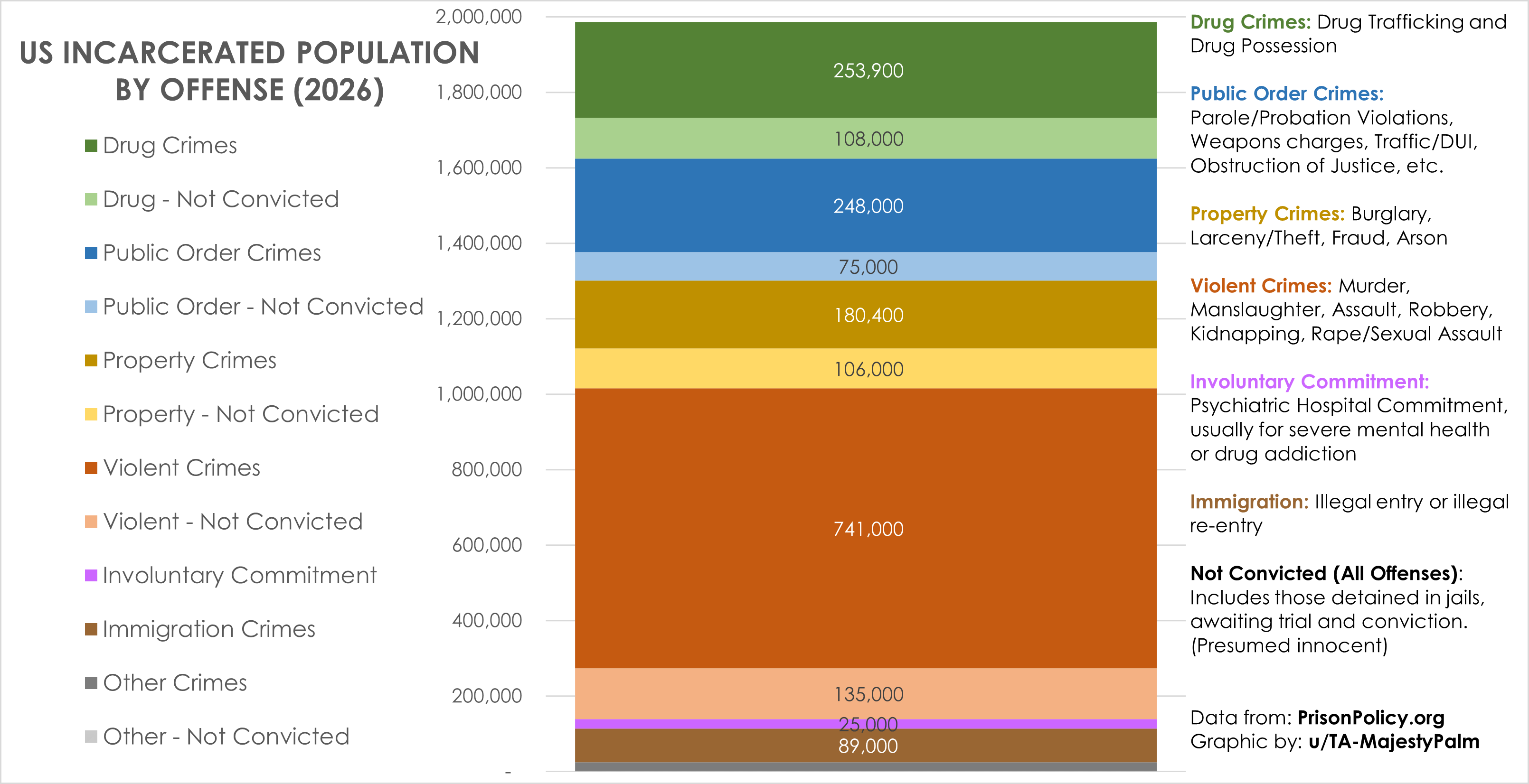
Graphic by me, created in Excel. This data includes everyone who is “locked up” currently in the US: National, State, and local prisons, jails, mental hospitals, youth detention centers, immigration offenders detained by ICE, military prison, etc.
I wanted to visualize what types of crime people are locked up for. This also includes those not convicted awaiting trail in jail (shown as a lighter color). Not all of these people will actually be convicted of the crime they are charged with.
Data source is here – they did all the hard work and have much more detailed graphics than mine. They pull from a number of different sources: https://www.prisonpolicy.org/reports/pie2026.html
Sorry but the y-axis on the left of the graph looks like it is listing the corresponding amounts for each of the items in the color coding legend (e.g., “Drug Crimes 1,600,000). Cool graph otherwise but that aspect is confusing. I’d suggest moving the color coding legend next to the graph and have arrows from each item to the to corresponding color. The legend can be flipped to the right side if needed to accomplish this, and the definitions can be incorporated into the legend or moved elsewhere (though, either way they should be closer to the terms they’re defining). Very interesting though!
The result is actually much more reasonable than I would have expected as an outsider. The drug/immigration part of the population is surely pointless, but at least it’s not dominant.
Didn’t expect the violent crimes to be so high or the prison population to be so low compared to our population (0.5%).
Definitely should have the Epstein criminals on this chart. /s
Because the Y axis is population, it implies that an inmate is charged with one of either a Drug Crime, Violent Crime, Property Crime, etc. when there are likely inmates charged with crimes that fall into multiple categories, no?