
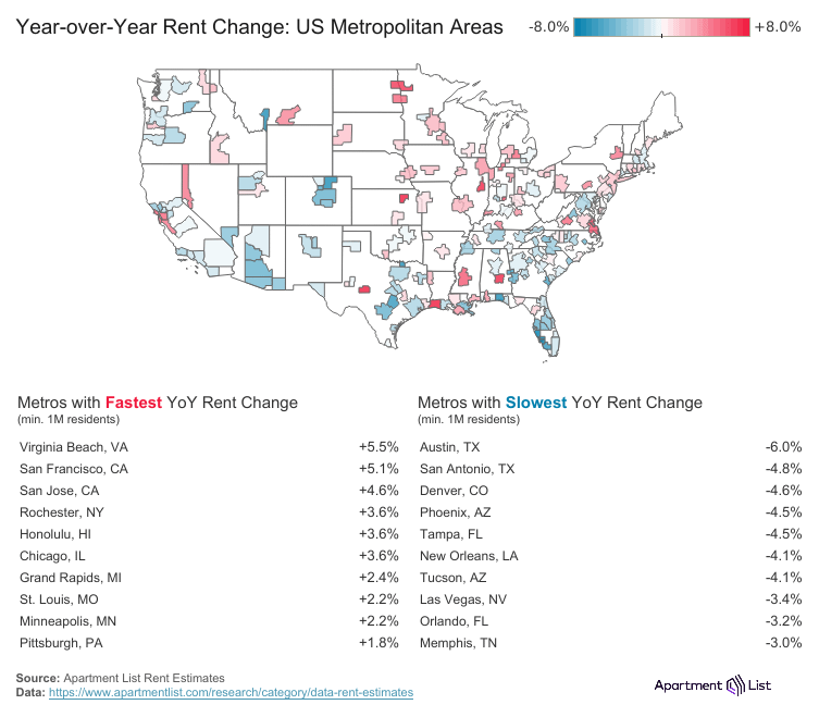
Year-over-year rent changes across U.S. metro areas, showing where prices are heating up and where they're cooling off
Interactive map: https://www.apartmentlist.com/research/national-rent-data
Source data: https://www.apartmentlist.com/research/category/data-rent-estimates
We estimate the median rent across new leases signed in a given market and month. Made via Tableau Public.
by Apartment_List
5 Comments
Sources!
Interactive map: [https://www.apartmentlist.com/research/national-rent-data](https://www.apartmentlist.com/research/national-rent-data)
Source data: [https://www.apartmentlist.com/research/category/data-rent-estimates](https://www.apartmentlist.com/research/category/data-rent-estimates)
Made via Tableau Public
OK at quick glance the list of fastest changing has Rochester NY at +3.6 … but is not on the map.
The map shows the Albany NY area as +4.5 which means it should be amongst the top changing … but it isn’t on the list.
Why did you name it Fastest and Slowest? Are these changes time related? It appears to be rent Increase and Decrease. Does your chart indicate that Austin Texas has a rent increase and it’s just taking a long time to increase? Confusing chart. I’m assuming it’s rent increase and decrease, but it’s not labeled that way.
A negative rent growth rate is not slower than a positive growth rate, it’s just in a different direction.
So I’m guessing BLUE is rent decreasing YoY? Why is Austin’s rent dropping so much? I thought people were still moving there in droves, driving up rent prices.