
We (WeatherMapping.com) have been working on adding weather-variable ranking metrics, and while examining some date-specific time series I wanted to visualize point locations in novel way.
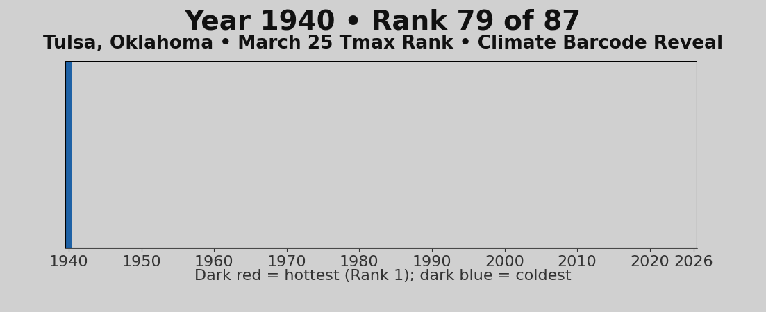
This animation shows how Tulsa, Oklahoma’s March 25 Maximum Temperature ranked year by year across the full 87-year record, including 2026. Each bar is one year, colored by rank from dark red = hottest (Rank 1) to dark blue = coldest. I chose Tulsa because i was shocked at how far yesterday temperature was above rank number 2 in real terms (nearly 7F higher difference).
I thought the barcode format was a clean way to show where a specific day sits in climate history without needing to read through raw numbers.
If you want to see the barcode for yesterday’s Maximum Temperature or for any other date – for a specific city or location, world wide, comment it below.
by ferguskeatinge
4 Comments
Data Source – [WeatherMapping.com](http://WeatherMapping.com)
Tools – Python (imageio.v2, matplotlib, matplotlib.pyplot, numpy and pandas)
Very cool. Neat way to visualize
I wonder what it would look like on a Grey scale, rather than blue to red. If midpoint was grey, hottest dark black and coldest white.
There is no need to add a time lapse to this graphic. It adds no useful information.
Otherwise, this is quite interesting and the final image (which unfortunately only displays for two seconds) is informative.
Pretty interesting, the blue and Orange works well. Maybe a golden yellow would be better for the orange to show the sun’s hotness, could potentially mean the background would change from grey to frost white