
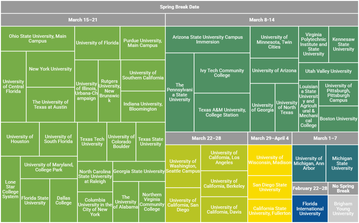
College size is in-person enrollment (total enrollment minus distance education enrollment) from the latest version of the NCES table 312.10 (2022). Spring break dates are pulled from each institution's website and rounded to the nearest whole week (in cases where schools included the preceding Friday, &c).
Generated using a Google Sheets treemap. Anyone know a better free tool for making these area-based charts?
by markegli
14 Comments
Source: college size is in-person enrollment (total enrollment minus distance education enrollment) from the latest version of the [NCES table 312.10](https://nces.ed.gov/programs/digest/2022menu_tables.asp) (2022). Spring break dates are pulled from each institution’s website and rounded to the nearest whole week (in cases where schools included the preceding Friday, &c).
Tool: generated using a Google Sheets treemap. Anyone know a better free tool for making these area-based charts?
Poor BYU students don’t get the chance to soak in Panama City.
BYU not having spring break makes so much sense lmao
I went to HS in the Fort Lauderdale area in the 80s (when it was still the Spring Break capital of the world). We would get lists like this so we could know what colleges to pretend to be from each weekend when we were out on the strip.
For anyone wondering why a community college is so large here, Ivy Tech has one accreditation (so one row in the data) but 41 locations across Indiana. Similarly, Northern Virginia Community College has six campuses.
If it were me, I wouldn’t use a tree map. I’d go with an area map.
X-axis: Date
Y-axis: Total population on spring break.
Population broken down into separate areas, and then you could use a colour scheme to indicate geography.
It might be a little weird with weekends overlapping, but I’m finding it a little hard to read with dates not being arranged chronologically.
The arrangement of this chart makes my head hurt. Just put it chronological.
The data is grounded in a common time series. Why did you choose not to present it chronologically? What insights are you expecting to invoke with this presentation?
could this just be a list? yes it could.
maybe a bar chart across calendar dates so we could see a distribution.
something beautiful with this data, perhaps?
kinda silly to have all the UCs separate — they are all on the exact same schedule quarters system
This data is not beautiful and actually makes it hard to look at the information
Probably the worst type of graph to show this data
Shoutout to Ivy Tech. It’s Indiana’s state community college system, the largest in the country. I worked at two universities in IN and I’ve never seen a system better integrated into businesses in the community and local universities. I understand that it has ton of high school dual enrollment to facilitate higher learning and college prep work in more rural areas, but I never saw that side of things myself. It has campuses on and feeds into the biggest employers in the states. Really a model of what states could be doing.
Would just “Penn State” fit better?